Hi! I have decided to start up a new blog with my photography musings now that I have finished my studies in photography with the Open College of the Arts. This new blog will cover a variety of topics and will reflect on my experiences of what attracts me to the medium of photography, especially in an urban context.
My mark following the November 2018 assessment by OCA of my Documentary module was 67%. I am very pleased with this result as it shows my hard work paid off and I am continuing to progress with the course.
My assessors gave me feedback I was pleased overall with although I will try to experiment with presentation of images/ideas more and be more assertive in my editing and selection process of images.
However, I know I have to continue to work hard with the rest of the course. Speaking of which, my new blogs for the next two modules: Body of Work and Contextual Studies can be found here respectively:
All of my coursework, assignments, work leading up to assignments and my learning log can be found on my blog.
Therefore I’ve made efforts to lay out the blog as clearly as possible by including tabs where these categories can be found. Here are some other pointers as to how to use the blog:
Most of the navigation is done by hovering over the relevant tab to view where a list of sub-navigation tabs can appear.
For the ‘Coursework’ tab there are sub-tabs for each part of the course with further sub-tabs for each part of coursework.
For ‘Assignments’ there are the relevant assignment tabs and under these there are more sub-tabs. ‘Work Leading up to Assignments’ is always the first sub-tab, then a logical development of each assignment as I put forward the original, get tutor feedback and act on it and then the revised assignment.
The Learning Log is similarly divided into sub-tabs; including books, independent research, study hangouts and study visits. It can be found at:
There are also many links within posts linking to other relevant posts I’ve made to show my development.
It is possible to search a term in the search bar on the top right of the blog below the header. Otherwise there are tags to navigate the blog by on the right also.
I felt I started a bit slowly with the course through to Assignment 1 as I was trying to grasp the concepts of Documentary. However, I would say I got on much better with the coursework leading up to Assignment 2, which was reflected in the quality and strong concepts evident in Assignment 2. The fact I started using images to illustrate my posts and ideas helped. I also tried to listen to the feedback provided by my tutor; with Assignment 1 for example I went back and made sure the photographs were consistent with each other to deliver a coherent project for the viewer. I presented Assignment 1 as a handmade book to fit the nature of the project and Assignment 2 in blog format as requested – found under the tab: ‘Assignment 2 – Ephemerality of the Image’. Subsequently I have decided Assignment 2 works also as large (A3) prints which I’ve included in my submission.
I continued to grow into Documentary with the coursework and Assignment for Part 3; often the coursework or independent research would inform or influence the relevant assignment. For Part 3 for example, the post: ‘Imaginary Documents’ on my blog informed my decision to concentrate less on aesthetics in a single-image narrative but more on telling a narrative within multiple images. Incidentally this can be found under the relevant ‘Coursework’ tab but also in the tab: ‘Work Leading up to Assignment 3’. This helped me to tell a narrative effectively and, with the guidance of my tutor, I omitted the captions so the photographs told the story themselves. I submitted Assignment 3 as a photo book, which unlike Assignment 1, was purposefully not handmade.
Aesthetics of an image was still on my mind while completing the coursework leading up to Assignment 4 because I chose to base my critical review around this. My tutor and some of my fellow students liked the personal element of this critical review. Here I reflected on my own work and a visit to an exhibition as well as of course looking at other artists in order to get a more reflexive idea of aesthetics and how they affect readability of an image to an audience.
Fellow student feedback and generally bouncing around ideas, especially in the study hangouts I attended and wrote-up (found under the tab: ‘Learning Log’ and then under: ‘Study Hangouts’, were very helpful for me. This was because they helped me feel part of a student community as well as encouraging me to produce work I was more satisfied with.
I produced the work I was most satisfied with for Assignment 5. The project took a lot of research and development and then patience while photographing. I thought the results were worth it because while I was taking a risk whether the project was strictly documentary photography, it still told a powerful and topical story within single-image narratives.
Again I listened to my tutor after receiving my feedback for Assignment 5 and changed the project from a diptych idea to a single-image narrative presentation with supporting documents, which somewhat altered the meaning of my relationship with the subjects of each single-image narrative. Therefore I’ve submitted the single-image narratives for Assignment 5 as large (A3 prints). Also on A3 there are the supporting documents but as there are several images on each piece of paper, they appear purposefully less significant than the single-image narratives.
Lastly, I had a productive Assignment 6 – pre-assessment review with my tutor who helped me with strategies for presentation. I took this on board and presented my work to a standard I would say I am satisfied with for assessment. We also discussed going forwards after Documentary. I felt like I was drawn to the landscape genre especially with people in the scene, adding vitality. This can be seen in Assignment 5 especially but I also acknowledge the need to experiment once I’ve commenced a project and take more risks. Perhaps experimenting with subverting the genre of landscape is a way of taking a risk as mentioned in my Assignment 6 – Pre-assessment Review.
I have been reading an article recommended to me by my tutor in which in one paragraph Quentin Bajac is discussing experimentation in photography with Philip Gefter. He starts with an interesting statement: ‘The most interesting photographers in that field are those who manage to find a proper balance between perception and the idea.’ – (Bajac and Gefter, 2013). With Assignment 2 for example, I concentrated perhaps too much on conceptualising before I commenced the project. This meant I struggled once I realised: ‘What you produce in the end will probably be quite different from the initial idea.’ – (Bajac and Gefter, 2013). Bajac then goes on to explain that you have to accept that [the world changes that idea] and shift your expectation to accommodate what you observe and evolve with it.’ – (Bajac and Gefter, 2013). For me this idea of shifting your expectation is one of adaptability. Bajac is quite succinctly illustrating that by experimenting on an idea once you have it (even if it is a loose idea) is key to adapting to the inevitable change once you try to implement it in the world around you. I felt this was something I could learn from going forwards.
References:
Bajac, Q. and Gefter, P. (2013). View from a Judgement Seat. Aperture, (213), pp.56-60.
My tutor suggested to me after receiving the book format for Assignment 5 – Tourism in London, and Me that perhaps this assignment didn’t work in a book format after all. Instead he encouraged me to think of a better way to display the photographs; particularly the ‘standalone’ photographs, which in the book comprised the first half of each diptych. At first I wasn’t that convinced that the book format didn’t work as I had become somewhat attached to the diptych idea to best contrast myself with the tourists in this assignment. However, by listening my tutor and experimenting, I came up with a different way to present the photographs. In retrospect I do like this method better as it alters the meaning of the work so that my relationship with the tourists is not the defining characteristic of the work but actually the photographs themselves stand out more.
1. Original Book Format Displaying a Diptych in a Relatively Small Format Despite a Quite Cramped Layout
The method I chose to present the work differed significantly from the book form. Unlike the book where the diptych placed equal weight on both parts of the diptych photographs, I replaced the diptych idea. I agreed with my tutor’s comments that the first half of each diptych’s photographs form the book deserved to be displayed as a singular centrepiece. This was because I felt they worked as a single-image narrative for each of the hotspots and their inevitable tourist visitors. They were the stronger images in my opinion. They were more effective being directly compared and contrasted against each other than against their diptych counterparts in the original book I’d produced.
2. Original Book Format Displaying a Diptych in a Relatively Small Format Despite a Quite Cramped Layout
I didn’t stop using the other side of the diptychs however. My tutor and I felt both they and the selfies I’d taken at each location in mimicry of the tourists were still effective images. They delved deeper into my relationship with the tourists as well as the whole ritual of selfie taking as souvenirs of an experience although this wasn’t fully explored in these pictures. Therefore I decided to include these images as ‘supporting documents’ to the standalone photographs.
3. Revised, Larger (A3) Format with Centrepiece (Top Left) and Supporting Documents (Bottom Right)
To incorporate the single-image narrative standalone photographs and the supporting documents together in one form I decided to move away from the book format. This was to better show off the standalone photographs by printing them large – A3 sized. If I was going to exhibit the photographs I would probably print even larger. The supporting documents were printed much smaller in comparison to the standalone photographs in order to convey to the viewer they were intended to support the centrepieces. For assessment I printed the supporting documents on a A3-sized piece of photographic paper for each tourist hotspot location. Each location’s A3 standalone photograph was therefore supported by another A3 piece of photographic paper but on these there was the mimicry by myself of the tourists’ selfie-taking and the selfies I’d taken at each of these positions in the respective locations. In this way, the standalone photographs were given much more prominence on the A3 paper than the supporting documents.
4. Revised, Larger (A3) Format with Centrepiece (Top Left) and Supporting Documents (Bottom Right)
After correspondence with my tutor in the pre-assessment review (Assignment 6) and some thinking on my part, I have essentially rearranged the presentation of Assignment 5. This is so it is possible to read the project in a different way than had it been left as it was presented in the original book format. Instead I’ve presented each main piece as a separate standalone photograph. Beside each standalone photograph is a supporting document. The original introduction for the project remains largely accurate:
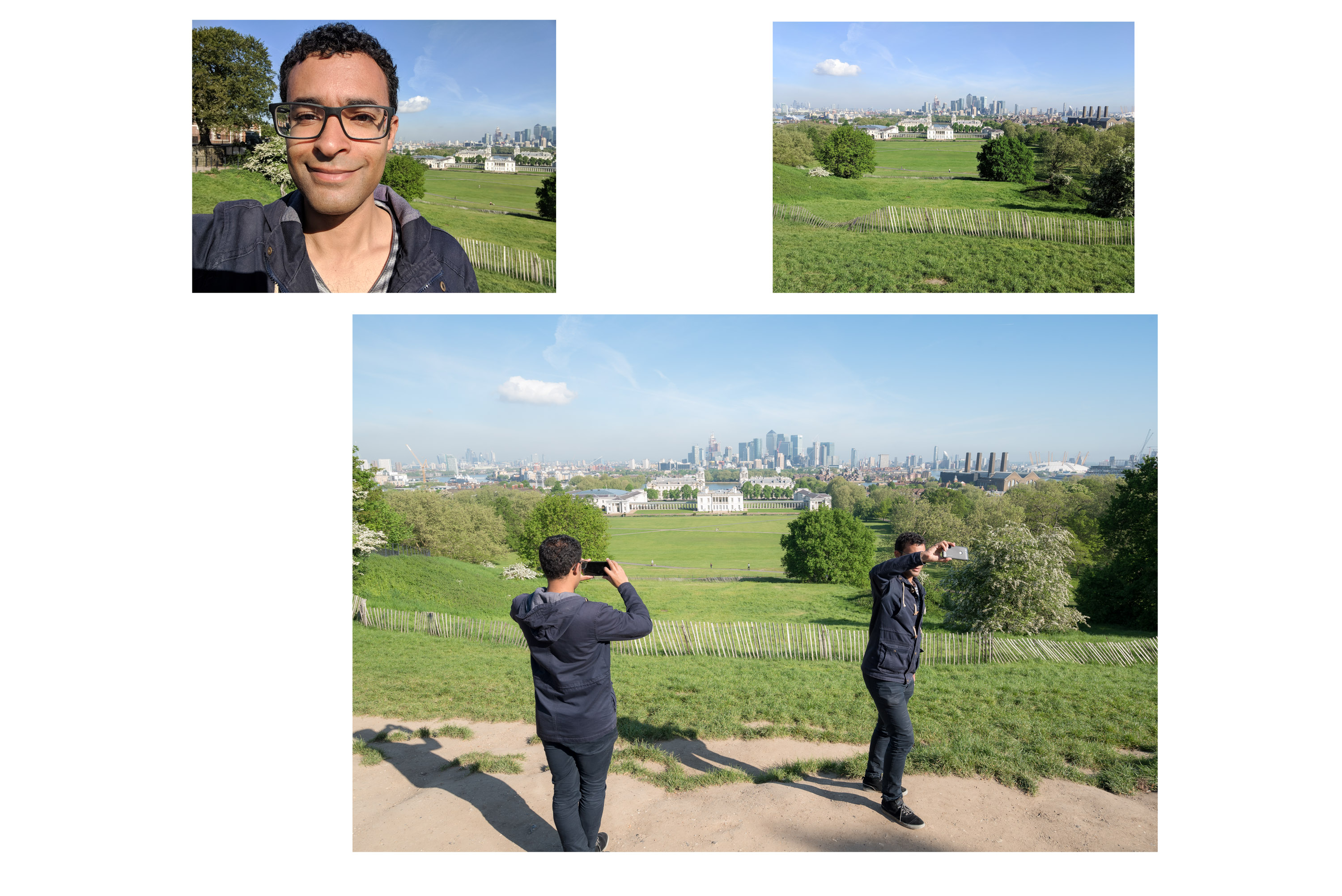
I have been documenting the picture-taking, particularly selfie-happy tourists who frequent London. The way I have decided to do this isn’t an accurate rendition of the scene as the photographs are no longer indexical to what was in front of the camera. Instead, I have utilised digital technologies to merge parts of multiple images into single composites. One of the conditions of optical perception inherent in photography (Eco, n.d.) is reduced (that of juxtapositions within the frame derived from the indexical relationship of the scene and the photograph in traditional photography). However, another is given for these particular scenes. Here at these tourist hotspots I’ve created a more accurate sense of what it is like to be in these magnets for tourists with selfies being taken left, right and centre. The clutter has been removed allowing the viewer to be more immersed in what has to me become more of a spectacle than the landmarks themselves. That is the spectacle of the spectacle – the unconscious performance by tourists of mass picture-taking from similar viewpoints with myself recording this spectacle in a cohesive manner. ‘The spectacle that falsifies reality is nevertheless a real product of that reality’ – (Debord, 1967). I would argue this quote could be applied to the composites I’ve created which have been drawn from reality.
I’ve taken the images from the perspective of an outsider looking in, even though I would call myself more of an insider as this is my home city. To support the single image composites I have repeated the images produced for each hotspot with myself imitating the tourists’ poses in front of the landmarks. ‘real life is materially invaded by the contemplation of the spectacle, and ends up absorbing it and aligning itself with it.’ – (Debord, 1967). I wanted to establish my own relationship to the tourists. This was that materially there was no relationship but within the pseudo-world of images I could assert my presence. This represents myself interacting with the tourists retrospectively. I have previously noted that tourists tend to reassure themselves when in unfamiliar places by simply taking pictures. Susan Sontag writes on tourism: ‘As photographs give people an imaginary possession of a past that is unreal, they also help people to take possession of a space in which they are insecure.’ – (Sontag, 1977). Using this line of thinking, just like the tourists picture-taking at the hotspots were doing as a kind of souvenir of their experience as outsiders looking in, I also used picture-taking as an outsider looking in, except the subject of my pictures were the tourists and their performance in front of the landmarks. My picture-taking too was a kind of reaction towards something I felt slightly unsure about.
Finally for this project, I took selfies and photos similar to what the tourists would have taken from the same position they (and I, retrospectively) had assumed in the composites I’d put together. For me this reaffirmed my experience in relation to the tourists; producing something tangible from a relationship I’d never been able to put my fingers on up until now.
Photograph 1 – Assignment 5 – Tourism in London, And Me
Supporting Document for Photograph 1 – Assignment 5 – Tourism in London, And Me
Photograph 2 – Assignment 5 – Tourism in London, And Me
Supporting Document for Photograph 2 – Assignment 5 – Tourism in London, And Me
Photograph 3 – Assignment 5 – Tourism in London, And Me
Supporting Document for Photograph 3 – Assignment 5 – Tourism in London, And Me
Photograph 4 – Assignment 5 – Tourism in London, And Me
Supporting Document for Photograph 4 – Assignment 5 – Tourism in London, And Me
Photograph 5 – Assignment 5 – Tourism in London, And Me
Supporting Document for Photograph 5 – Assignment 5 – Tourism in London, And Me
Photograph 6 – Assignment 5 – Tourism in London, And Me
Supporting Document for Photograph 6 – Assignment 5 – Tourism in London, And Me
Photograph 7 – Assignment 5 – Tourism in London, And Me
Supporting Document for Photograph 7 – Assignment 5 – Tourism in London, And Me
References:
Debord, G. (1967). Society of the Spectacle. 3rd ed. London: Rebel Press, pp. 7-8.
Eco, U. (n.d.) In. Burgin, V. (1982) Thinking About Photography. London: MacMillan.
Sontag, S. (1977). On Photography. New York: Farrar, Straus and Giroux, pp. 12.
Does the type of aesthetic approach employed by the photographer affect the way a photograph is read by an audience?
Aesthetics are a key attribute of a photograph. They affect the reader’s gaze and so photographers are faced with the question of whether to make their photographs aesthetically-pleasing or not aesthetically-pleasing. I have juggled between the beautiful (which I find aesthetically-pleasing) and ‘gritty’ (which I find truer-to-life but not aesthetically-pleasing). What constitutes ‘aesthetically-pleasing’ or ‘not aesthetically pleasing’ is a very subjective topic though. What might be a beautiful for some might be ugly for others. Likewise, what may be gritty for some might be enchanting for others. This disparity is due to the fact that each viewer’s taste for pleasing aesthetics varies. ‘Judging beauty and other aesthetic qualities of photographs is a highly subjective task.’ – (Datta, Joshi, Li, Wang, 2006). Although this is a subjective task, by using a computational approach it has been possible to see ‘there exist certain visual properties which make photographs, in general, more aesthetically beautiful.’ – (Datta, Joshi, Li, Wang, 2006). Therefore although aesthetics are subjective, they do conform somewhat to a standard. It is our natural inclination to make aesthetically-pleasing photographs too: ‘Except for those situations in which the camera is used to document, or to mark social rites, what moves people to take photographs is finding something beautiful.’ – (Sontag, 1977). The intended usage of the photograph is one factor to take into account because it can dictate whether a photograph is used to document or to find something beautiful.
Certain photographers combine these two disciplines (documenting and finding something beautiful) to express powerfully their vision and one such photographer is Sebastião Salgado. ‘In their strong formal design, Salgado’s pictures revive photographic modernism with its emphasis on geometry and visual contrast. Beauty is pressed into the service of an old-fashioned humanism…’ – (Stallabrass, 1997). This description of his photographic approach shows Salgado’s strong aesthetics but also hints at his moral code when taking these photographs. Although he has been very successful in his projects, he has also been criticised by some for the beauty inherent in even his most haunting photojournalistic photographs. One prominent critic of Salgado’s ‘aestheticisation’ of suffering was Ingrid Sischy. She argued that ‘this beautification of tragedy results in pictures that ultimately reinforce our passivity toward the experience they reveal.’ – (Sischy, 1991). By combining documenting something factual with the aestheticisation of these facts, Salgado is in fact detracting from the photographs’ message in terms of their power to portray the truth of what they depict.
I would agree on a base level that the viewer of such photographs (Salgado’s beautiful documents) is more likely to be distracted from the message because of the aesthetics than had the photographs simply aimed to portray ‘the truth’. Although the photographer’s intentions might be honest, it is easy with photography to let aesthetics get in the way of truth. For example with Fig. 1, (Mraz, 2002) makes the point that: ‘The photo’s psychological tone is set by the solemn expressions on the children’s faces and their prostration on the floor’. In my eyes though the ethereal lighting from solely the open doorway with the strong tones of light and dark created from this (especially on the bones themselves) capture and divert my attention for far longer. However, I would also then suggest the critic of such an argument – that Salgado’s aesthetics distract from the message – is missing a vital point. Salgado’s projects clearly reach a great audience and in this regard at least he has been successful. If his works’ aesthetics were not so powerful and beautiful would his work have reached so massive an audience? Therefore perhaps Salgado is looking at the wider picture in so far as getting a message across, even if it means aestheticising the facts.
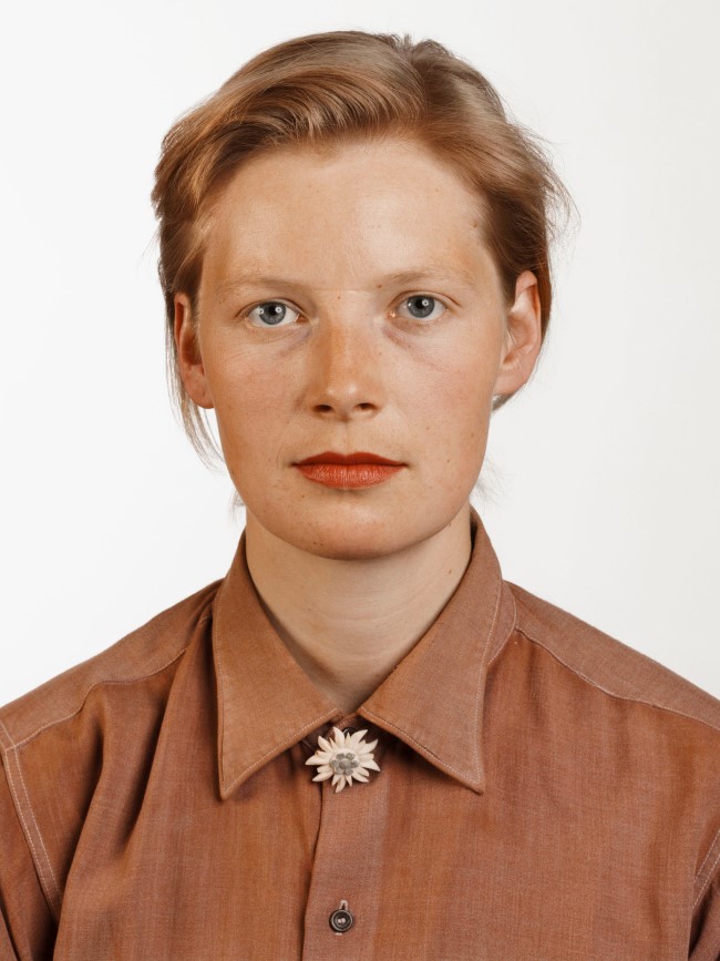
So far I have only been concerned with superficial aesthetics of photography as this is the foremost feature people get to when looking at photographs. Photographs can also be regarded as beautiful beneath their outward appearance and I would assert that this gives such photographs more liability to possess deeper meaning once the message has been uncovered. A photographer I have recently been to an exhibition of: Thomas Ruff springs to mind as an example where the work is not immediately beautiful (at least to my eye) but instead the viewer has to read into the work to find beautiful meanings within the work. One of his most famous projects: Portraits 1986-1991 (see Fig. 2) employs several strategies to enable the viewer to find meaning within the work which I myself found beautiful. Showing Fig. 2 in this size on my blog felt like I was doing a disservice to the impact the enormous print has on the viewer when looking at it in a gallery. On the other hand the superficial aesthetics were not particularly pleasing to the eye; the lighting was quite flat and at first glance it seemed quite bland. Interestingly, this could be exactly the kind of reason Ruff employed such aesthetics – getting across the meaning in part to me as a reader of the portraits. Looking at Ruff’s Portraits 1986-1991 again, they did grow on me as the lighting is quite soft in fact yet shows off all the features of each sitters’ face. The photographs depicting the blank expressions of people Ruff knew from those years give away nothing, because ’even though they show every detail of the skin, clothes, and hair of the sitter, they still don’t try to show any of his or her feelings’ – (Blank and Ruff, 2004). This is a kind of paradox but an effective one because by giving away nothing superficially, the viewer inevitably begins to wonder about the bigger picture. Scale is also part of the ruse where Ruff produces these massive prints of vacant faces, enticing the viewer to wonder why they are printed so monumentally big when they are just like passport pictures. Unearthing the message beneath – for me it was that the passport style pictures allow the viewer their own interpretation of the sitter which is ultimately a contrived one – was a rewarding experience.
Although I picked up on this meaning somewhat by myself I still had to back up my assertions from another source – ‘a portrait by Ruff looks like a very large passport photograph. … Any personality a sitter may have is there because you, the viewer, have projected your own feelings and prejudices on to the image.’ – (Dorment, 2003). In my opinion this gaining of understanding, while rewarding, is also less immediate and has less widespread ‘appeal’ than the superficially beautiful work of for example Salgado. Because the reader has to search for the beauty embedded inside rather than on the surface, more casual readers may not bother gaining understanding from work like Ruff’s, where the aesthetics are imbued within. Looking at this from an aesthetic point of view it would be possible to argue that both draw from the vernacular: Ruff playing upon it intentionally by taking all the ‘accidental’ elements out of the traditional vernacular and using them to his advantage like with his Portraits 1986-1991 project (see Fig. 2). On the other hand, Salgado employs telling juxtapositions (like the children juxtaposed with the bones in Fig. 1 and combines this with selective framing and often dramatic, otherworldly lighting. All of this becomes unified because Salgado continues to utilise the black and white medium. Although this might seem like the opposite of traditional vernacular imagery (where colourful, seemingly accidental snapshots are prevalent), looking closer it seems Salgado has culminated the ingredients of the vernacular into a more sophisticated version.
Fig. 3. Photograph 4 – Assignment 3 – Documentary
I have until recently always given slight precedence to the superficial aesthetics attribute of my photography and in part it has defined the images I’ve produced for my projects. In hindsight this was perhaps an attempt to move it away from the vernacular type imagery pervading social media. With Assignment 3 – Documentary (see Fig. 3) I turned my attention away from my inward battle between superficial aesthetics and meaning. Instead I put my efforts into telling a convincing story; letting meaning come first and putting aesthetics to the side. Interestingly I found they were still linked as the aesthetics when consistent, combined to tell a more immersive story. However, I noticed certain photographers disregarded superficial aesthetics altogether or even deliberately to make them gritty such as Daido Moriyama.
Moriyama at the time he was taking photos on the streets of Tokyo (in the 1960s) prescribed like the group of left-wing photographers he joined to a style developed to break away from aesthetic conventions of a ‘good’ photograph found in European and American photography. They instead employed an aesthetic that ‘was identified with the expression are, bure, boke – grainy, blurry and out of focus, in reference to the three main characteristics that distinguished the group’s images’ – (Scaldaferri , 2017). Moriyama’s reasoning for using such gritty aesthetics (see Fig. 4) was that he was ‘Refusing the idea that the photographic medium could only be used to produce archival documents,’ instead ‘putting an accent on its image-making capability’ – (Scaldaferri , 2017). He thereby used the aesthetics of are, bure, boke as a conduit to express his opinions about the state of Tokyo’s dark streets at that time.
Later, after Provoke, Moriyama published Bye Bye Photography (1972). Bye Bye Photography used the same are, bure, boke aesthetics but offered even less of a sense of subject matter throughout the book. Instead it became more introspective in terms of it attempting to deconstruct photography and I found worked better as a kind of flowing text rather than looking at each image singularly. Therefore Bye Bye Photography used consistent aesthetics both superficial and otherwise as a tool to challenge the medium of photography – ‘attempt to deconstruct the medium in [Moriyama’s] series Shashin yo sayonara (Farewell Photography) (1972), though it ultimately deconstructed him.’ – (SFMOMA , 2016). This again shows the importance of consistent aesthetics even though in this instance the result was so destructive.
Moriyama was and remains very popular, influencing other photographers and young people especially in Japan: ‘The older generation appreciates a lot of Daido’s work, but right now he is very, very popular among young people’ – (Uematsu, 2012). However, the appeal of his work is not as widespread (outside of Japan) as say Salgado. I would argue this is because it is necessary with Moriyama’s work (like Ruff’s Portraits 1986-1991) to look further beyond the superficial, which acts as just an (aesthetically-consistent) gateway to the meaning found within. What I could see influencing me from Moriyama’s work would be the understanding that the process of making an image can be far more important in terms of reflexivity conveyed in this process than the aesthetic. Having said this, Moriyama clearly intends to go consistently for the ‘are, bure, boke’ look. For me this deliberation could be because his work transcends the traditional vernacular with the choice of are, bure, boke black and white medium as a consistent aesthetic with reflexive meaning caught across these frames.
Conclusion:
While it may be true that photographs with gritty superficial aesthetics are not as accessible as work which conforms to our standard taste for the beautiful, often there is a space for deeper meaning to be accessed by the viewer in the work. This could be whether it is intended by the photographer – by playing upon the vernacular – or not. As long as the work is consistent too the viewer may gain more from a set of photographs than a singular, glorified image. Also it may well be important to the photographer to display reflexivity in their photographs which in itself could be considered beautiful. In a funny kind of way photographic projects with aesthetics that don’t conform to a standard taste for the beautiful have more art value than work which doesn’t play on the vernacular or is less emotional. All of this depends on what kind of impact the photographer wishes to make and to what type of audience.
‘something considered beautiful conforms to a standard taste, whereas something considered as ugly may confront our present sensibility and bring out a new one.’ – (Fontcuberta and Feustel, 2010). While this quote by Joan Fontcuberta when talking about beauty shows that a deeper meaning or even new sensibilities may be brought out when we are faced with work that is not superficially beautiful, I would suggest it tends to lose the widespread appeal that comes from conforming to our (natural) taste for the beautiful. Yet I would also make the point that confronting our current sensibility and potentially bringing out a new sensibility may be more important to many photographers/artists. This would be especially true considering the current climate of image making where social media platforms are over saturated with similar images that conform to our standard taste for the beautiful.
Word Count:
2,168 (Including Quotes)
References:
Blank, G. and Ruff, T. (2004). Gil Blank and Thomas Ruff in Conversation. Influence, (2), p.51.
Datta R., Joshi D., Li J., Wang J.Z. (2006) Studying Aesthetics in Photographic Images Using a Computational Approach. In: Leonardis A., Bischof H., Pinz A. (eds) Computer Vision – ECCV 2006. ECCV 2006. Lecture Notes in Computer Science, vol 3953. Springer, Berlin, Heidelberg, (10) pp.288-289.
Uematsu, E. (n.d.). In. Birmingham, L. (2012). “Labyrinth” by Daido Moriyama: Contacting the Urban Jungle. [online] Lucybirmingham.com. Available at: http://lucybirmingham.com/?p=1502 [Accessed 7 Jan. 2018].
I have gained feedback from my tutor regarding my original Critical Review and have now decided to go back over my tutor’s comments. While it was for the most part well received, there were of course some improvements that could be made. My tutor helpfully highlighted these for me and I would suggest the improvements I have been asked to consider making are pretty much all things I agree about in retrospect. I have decided to make this post to go along with the revised version of my critical review with the changes marked in red so it is possible to see exactly my thought processes while making the amendments.
I started the original critical review with a question which I had changed as the critical review developed in the first place several times. The question ranged from: ‘Because it is our natural inclination to make aesthetically-pleasing photographs, when this is achieved does this then render the photograph’s meaning disparate from its aesthetics?’ To: ‘Because it is our natural inclination to make aesthetically-pleasing photographs, when this is carried out does this then detract from a photograph’s meaning?’ As well as: ‘It is our natural inclination to make aesthetically-pleasing photographs. When this is carried out does this then render a photograph’s meaning artificial?’ Finally I settled on: ‘Does the type of aesthetic approach employed by the photographer affect the accessibility of the work to an audience?’ I felt at the time this was a more concise question. However, my tutor has picked out a part to the question which I too fell could be construed in different ways. Namely: ‘affect the accessibility of the work’ which could potentially mean the logistics of getting the work to an audience. This wasn’t the intended meaning of the term accessibility which in my mind had meant ‘readability’. Therefore, similar to my tutor’s suggestion I changed the question to: ‘Does the type of aesthetic approach employed by the photographer affect the way a photograph is read by an audience?’.
I started the answer to my question in the original critical review with a statement that aesthetics affect the reader of a photograph’s gaze and so the photographer is faced with whether to make the work ‘aesthetically-pleasing or gritty’ Just by using the term ‘gritty’ I was making an uninformed opinion that ‘gritty’ was the opposite of ‘aesthetically-pleasing’! My tutor duly pointed this out by remarking that ‘Gritty can be a kind of pleasing aesthetic though’. Although I agreed with my tutor, I did scratch my head wondering how best to implement my uninformed opinion about gritty and my tutor’s remark about gritty having the potential to be a kind of pleasing aesthetic too. The next line of my essay did introduce the subjectivity of aesthetics and my tutor’s report for my learning log signalled he liked the personal element of my review. Therefore I decided to use these facts to restructure the essay. I admitted my personal preferences for what was aesthetically-pleasing and not aesthetically-pleasing and then showed that this was a subjective opinion and that it varies among people what their aesthetic tastes are.
A quick update from ‘aestheticising’ to ‘aestheticisation’ here.
My next point of debate was that of photographic truth. I wrote in my original critical review that: ‘I would agree on a base level that the viewer of such photographs (Salgado’s beautiful documents) is more likely to be distracted from the message because of the aesthetics than had the photographs simply aimed to portray ‘the truth’.’ My tutor didn’t necessarily find anything wrong with this quote but wrote: ‘mmmm. Truth is a tricky concept isn’t it.’ I decided to expand on my notion of photographic portrayal of truth by saying that: ‘although the photographer’s intentions might be honest, it is easy with photography to let aesthetics get in the way of truth.’
Moving on to the part of the critical review where I considered the impression Thomas Ruff’s Portraits 1986-1991 series made on me, my tutor and I’s opinions differed significantly. He found the superficial aesthetics of Ruff’s Portraits 1986-1991 pleasing, while I had said in my essay: ‘the superficial aesthetics were not particularly pleasing to the eye. I didn’t say the aesthetics were displeasing; however I also didn’t say why I didn’t find them particularly pleasing. My prompted reasoning for why I wasn’t particularly enamoured with the aesthetics was just that the lighting was quite flat and at first glance it seemed quite bland. Interestingly, this could be exactly the kind of reason Ruff succeeded in getting across the meaning of passport photo to me as a reader of the portraits. Looking at Ruff’s Portraits 1986-1991 again, they did grow on me as the lighting is quite soft in fact so I can see where my tutor is coming from.
My tutor referenced an article when he observed I had written initially ‘blank expressions of people’ while describing Ruff’s Portraits 1986-1991. In my eyes he referenced this article for me in order to get me to think more deeply about why the expressions of the sitters were ‘blank’ and I would say I am satisfied with my final answer having read through the referenced article. The subsequent changes I made to the essay took into account the lighting (which showed everything of the sitter’s features) and in turn how showing this paradoxically helped to reveal nothing about the sitter’s feeling (as described by Ruff in the article), helped by their blank expressions. I then went on to suggest how this would affect the viewer’s experience of the portraits in relation to the size they were printed in the gallery I viewed them in (the Whitechapel gallery).
I replaced ‘emotions’ with ‘opinions’ because I felt that while Moriyama may have had ‘emotions’ present concerning the ‘dark streets of Tokyo’ and its politics, he remained detached while photographing and therefore ‘opinions’ was a better description. Also I added the book Bye Bye Photography (1972) as a reference to how a consistent project aesthetically could influence a work and how it was linked to readability rather than emotion.
I decided (with the help of my tutor’s comments) that the reasoning ‘this is because it does not conform to (a Western at least) standard taste for the beautiful which has been more popular’ was largely unfounded as Moriyama had been influenced by William Klein and also Robert Frank who were both Western photographers. I changed instead my reasoning to: ‘I would argue this is because it is necessary with Moriyama’s work (like Ruff’s Portraits 1986-1991) to look further beyond the superficial, which acts as just an (aesthetically-consistent) gateway to the meaning found within’ which was much more reasonable and tied in with the rest of my essay.
A continuation of 7. with the removal of ‘emotion’ – this time being linked with beauty in my critical review. I used instead the term reflexive where Moriyama’s work was subjective but in a way that he looked at the medium he was working with.
I added the new references for the relevant quotes as well as the page numbers for one of the references my tutor had picked up on me missing out in the original essay.
I have edited my critical review which can be seen below with the changes made marked in red. The reasoning for the changes made can be found here.
Does the type of aesthetic approach employed by the photographer affect (1) the way a photograph is read by an audience?
Aesthetics are a key attribute of a photograph. They affect the reader’s gaze and so photographers are faced with the question of whether to make their photographs aesthetically-pleasing or (2) not aesthetically-pleasing. I have juggled between the beautiful (which I find aesthetically-pleasing) and ‘gritty’ (which I find truer-to-life but not aesthetically-pleasing). What constitutes ‘aesthetically-pleasing’ or ‘not aesthetically pleasing’ is a very subjective topic though. (2) What might be a beautiful for some might be ugly for others. Likewise, what may be gritty for some might be enchanting for others. This disparity is due to the fact that each viewer’s taste for pleasing aesthetics varies. ‘Judging beauty and other aesthetic qualities of photographs is a highly subjective task.’ – (Datta, Joshi, Li, Wang, 2006). Although this is a subjective task, by using a computational approach it has been possible to see ‘there exist certain visual properties which make photographs, in general, more aesthetically beautiful.’ – (Datta, Joshi, Li, Wang, 2006). Therefore although aesthetics are subjective, they do conform somewhat to a standard. It is our natural inclination to make aesthetically-pleasing photographs too: ‘Except for those situations in which the camera is used to document, or to mark social rites, what moves people to take photographs is finding something beautiful.’ – (Sontag, 1977). The intended usage of the photograph is one factor to take into account because it can dictate whether a photograph is used to document or to find something beautiful.
Certain photographers combine these two disciplines (documenting and finding something beautiful) to express powerfully their vision and one such photographer is Sebastião Salgado. ‘In their strong formal design, Salgado’s pictures revive photographic modernism with its emphasis on geometry and visual contrast. Beauty is pressed into the service of an old-fashioned humanism…’ – (Stallabrass, 1997). This description of his photographic approach shows Salgado’s strong aesthetics but also hints at his moral code when taking these photographs. Although he has been very successful in his projects, he has also been criticised by some for the beauty inherent in even his most haunting photojournalistic photographs. One prominent critic of Salgado’s ‘aestheticisation’ of suffering was Ingrid Sischy. She argued that ‘this beautification of tragedy results in pictures that ultimately reinforce our passivity toward the experience they reveal.’ – (Sischy, 1991). By combining documenting something factual with the (3) aestheticisation of these facts, Salgado is in fact detracting from the photographs’ message in terms of their power to portray the truth of what they depict.
I would agree on a base level that the viewer of such photographs (Salgado’s beautiful documents) is more likely to be distracted from the message because of the aesthetics than had the photographs simply aimed to portray ‘the truth’. (4) Although the photographer’s intentions might be honest, it is easy with photography to let aesthetics get in the way of truth. For example with Fig. 1, (Mraz, 2002) makes the point that: ‘The photo’s psychological tone is set by the solemn expressions on the children’s faces and their prostration on the floor’. In my eyes though the ethereal lighting from solely the open doorway with the strong tones of light and dark created from this (especially on the bones themselves) capture and divert my attention for far longer. However, I would also then suggest the critic of such an argument – that Salgado’s aesthetics distract from the message – is missing a vital point. Salgado’s projects clearly reach a great audience and in this regard at least he has been successful. If his works’ aesthetics were not so powerful and beautiful would his work have reached so massive an audience? Therefore perhaps Salgado is looking at the wider picture in so far as getting a message across, even if it means aestheticising the facts.
So far I have only been concerned with superficial aesthetics of photography as this is the foremost feature people get to when looking at photographs. Photographs can also be regarded as beautiful beneath their outward appearance and I would assert that this gives such photographs more liability to possess deeper meaning once the message has been uncovered. A photographer I have recently been to an exhibition of: Thomas Ruff springs to mind as an example where the work is not immediately beautiful (at least to my eye) but instead the viewer has to read into the work to find beautiful meanings within the work. One of his most famous projects: Portraits 1986-1991 (see Fig. 2) employs several strategies to enable the viewer to find meaning within the work which I myself found beautiful. Showing Fig. 2 in this size on my blog felt like I was doing a disservice to the impact the enormous print has on the viewer when looking at it in a gallery. On the other hand the superficial aesthetics were not particularly pleasing to the eye; the lighting was quite flat and at first glance it seemed quite bland. (5) Interestingly, this could be exactly the kind of reason Ruff employed such aesthetics – getting across the meaning in part to me as a reader of the portraits. Looking at Ruff’s Portraits 1986-1991 again, they did grow on me as the lighting is quite soft in fact yet shows off all the features of each sitters’ face. The photographs depicting the blank expressions of people Ruff knew from those years (6) give away nothing, because ’even though they show every detail of the skin, clothes, and hair of the sitter, they still don’t try to show any of his or her feelings’ – (Blank and Ruff, 2004). This is a kind of paradox but an effective one because by giving away nothing superficially, the viewer inevitably begins to wonder about the bigger picture. Scale is also part of the ruse where Ruff produces these massive prints of vacant faces, enticing the viewer to wonder why they are printed so monumentally big when they are just like passport pictures. Unearthing the message beneath – for me it was that the passport style pictures allow the viewer their own interpretation of the sitter which is ultimately a contrived one – was a rewarding experience.
Although I picked up on this meaning somewhat by myself I still had to back up my assertions from another source – ‘a portrait by Ruff looks like a very large passport photograph. … Any personality a sitter may have is there because you, the viewer, have projected your own feelings and prejudices on to the image.’ – (Dorment, 2003). In my opinion this gaining of understanding, while rewarding, is also less immediate and has less widespread ‘appeal’ than the superficially beautiful work of for example Salgado. Because the reader has to search for the beauty embedded inside rather than on the surface, more casual readers may not bother gaining understanding from work like Ruff’s, where the aesthetics are imbued within. Looking at this from an aesthetic point of view it would be possible to argue that both draw from the vernacular: Ruff playing upon it intentionally by taking all the ‘accidental’ elements out of the traditional vernacular and using them to his advantage like with his Portraits 1986-1991 project (see Fig. 2). On the other hand, Salgado employs telling juxtapositions (like the children juxtaposed with the bones in Fig. 1 and combines this with selective framing and often dramatic, otherworldly lighting. All of this becomes unified because Salgado continues to utilise the black and white medium. Although this might seem like the opposite of traditional vernacular imagery (where colourful, seemingly accidental snapshots are prevalent), looking closer it seems Salgado has culminated the ingredients of the vernacular into a more sophisticated version.
Fig. 3. Photograph 4 – Assignment 3 – Documentary
I have until recently always given slight precedence to the superficial aesthetics attribute of my photography and in part it has defined the images I’ve produced for my projects. In hindsight this was perhaps an attempt to move it away from the vernacular type imagery pervading social media. With Assignment 3 – Documentary (see Fig. 3) I turned my attention away from my inward battle between superficial aesthetics and meaning. Instead I put my efforts into telling a convincing story; letting meaning come first and putting aesthetics to the side. Interestingly I found they were still linked as the aesthetics when consistent, combined to tell a more immersive story. However, I noticed certain photographers disregarded superficial aesthetics altogether or even deliberately to make them gritty such as Daido Moriyama.
Moriyama at the time he was taking photos on the streets of Tokyo (in the 1960s) prescribed like the group of left-wing photographers he joined to a style developed to break away from aesthetic conventions of a ‘good’ photograph found in European and American photography. They instead employed an aesthetic that ‘was identified with the expression are, bure, boke – grainy, blurry and out of focus, in reference to the three main characteristics that distinguished the group’s images’ – (Scaldaferri , 2017). Moriyama’s reasoning for using such gritty aesthetics (see Fig. 4) was that he was ‘Refusing the idea that the photographic medium could only be used to produce archival documents,’ instead ‘putting an accent on its image-making capability’ – (Scaldaferri , 2017). He thereby used the aesthetics of are, bure, boke as a conduit to express his (7) opinions about the state of Tokyo’s dark streets at that time.
(7) Later, after Provoke, Moriyama published Bye Bye Photography (1972). Bye Bye Photography used the same are, bure, boke aesthetics but offered even less of a sense of subject matter throughout the book. Instead it became more introspective in terms of it attempting to deconstruct photography and I found worked better as a kind of flowing text rather than looking at each image singularly. Therefore Bye Bye Photography used consistent aesthetics both superficial and otherwise as a tool to challenge the medium of photography – ‘attempt to deconstruct the medium in [Moriyama’s] series Shashin yo sayonara (Farewell Photography) (1972), though it ultimately deconstructed him.’ – (SFMOMA , 2016). This again shows the importance of consistent aesthetics even though in this instance the result was so destructive.
Moriyama was and remains very popular, influencing other photographers and young people especially in Japan: ‘The older generation appreciates a lot of Daido’s work, but right now he is very, very popular among young people’ – (Uematsu, 2012). However, the appeal of his work is not as widespread (outside of Japan) as say Salgado. (8) I would argue this is because it is necessary with Moriyama’s work (like Ruff’s Portraits 1986-1991) to look further beyond the superficial, which acts as just an (aesthetically-consistent) gateway to the meaning found within. What I could see influencing me from Moriyama’s work would be the understanding that the process of making an image can be far more important in terms of (9) reflexivity conveyed in this process than the aesthetic. Having said this, Moriyama clearly intends to go consistently for the ‘are, bure, boke’ look. For me this deliberation could be because his work transcends the traditional vernacular with the choice of are, bure, boke (9) black and white medium as a consistent aesthetic with reflexive meaning caught across these frames.
Conclusion:
While it may be true that photographs with gritty superficial aesthetics are not as accessible as work which conforms to our standard taste for the beautiful, often there is a space for deeper meaning to be accessed by the viewer in the work. This could be whether it is intended by the photographer – by playing upon the vernacular – or not. As long as the work is consistent too the viewer may gain more from a set of photographs than a singular, glorified image. Also it may well be important to the photographer to display (9) reflexivity in their photographs which in itself could be considered beautiful. In a funny kind of way photographic projects with aesthetics that don’t conform to a standard taste for the beautiful have more art value than work which doesn’t play on the vernacular or is less emotional. All of this depends on what kind of impact the photographer wishes to make and to what type of audience.
‘something considered beautiful conforms to a standard taste, whereas something considered as ugly may confront our present sensibility and bring out a new one.’ – (Fontcuberta and Feustel, 2010). While this quote by Joan Fontcuberta when talking about beauty shows that a deeper meaning or even new sensibilities may be brought out when we are faced with work that is not superficially beautiful, I would suggest it tends to lose the widespread appeal that comes from conforming to our (natural) taste for the beautiful. Yet I would also make the point that confronting our current sensibility and potentially bringing out a new sensibility may be more important to many photographers/artists. This would be especially true considering the current climate of image making where social media platforms are over saturated with similar images that conform to our standard taste for the beautiful.
Word Count:
2,168 (Including Quotes)
References:
(10) Blank, G. and Ruff, T. (2004). Gil Blank and Thomas Ruff in Conversation. Influence, (2), p.51.
Datta R., Joshi D., Li J., Wang J.Z. (2006) Studying Aesthetics in Photographic Images Using a Computational Approach. In: Leonardis A., Bischof H., Pinz A. (eds) Computer Vision – ECCV 2006. ECCV 2006. Lecture Notes in Computer Science, vol 3953. Springer, Berlin, Heidelberg, (10) pp.288-289.
Uematsu, E. (n.d.). In. Birmingham, L. (2012). “Labyrinth” by Daido Moriyama: Contacting the Urban Jungle. [online] Lucybirmingham.com. Available at: http://lucybirmingham.com/?p=1502 [Accessed 7 Jan. 2018].
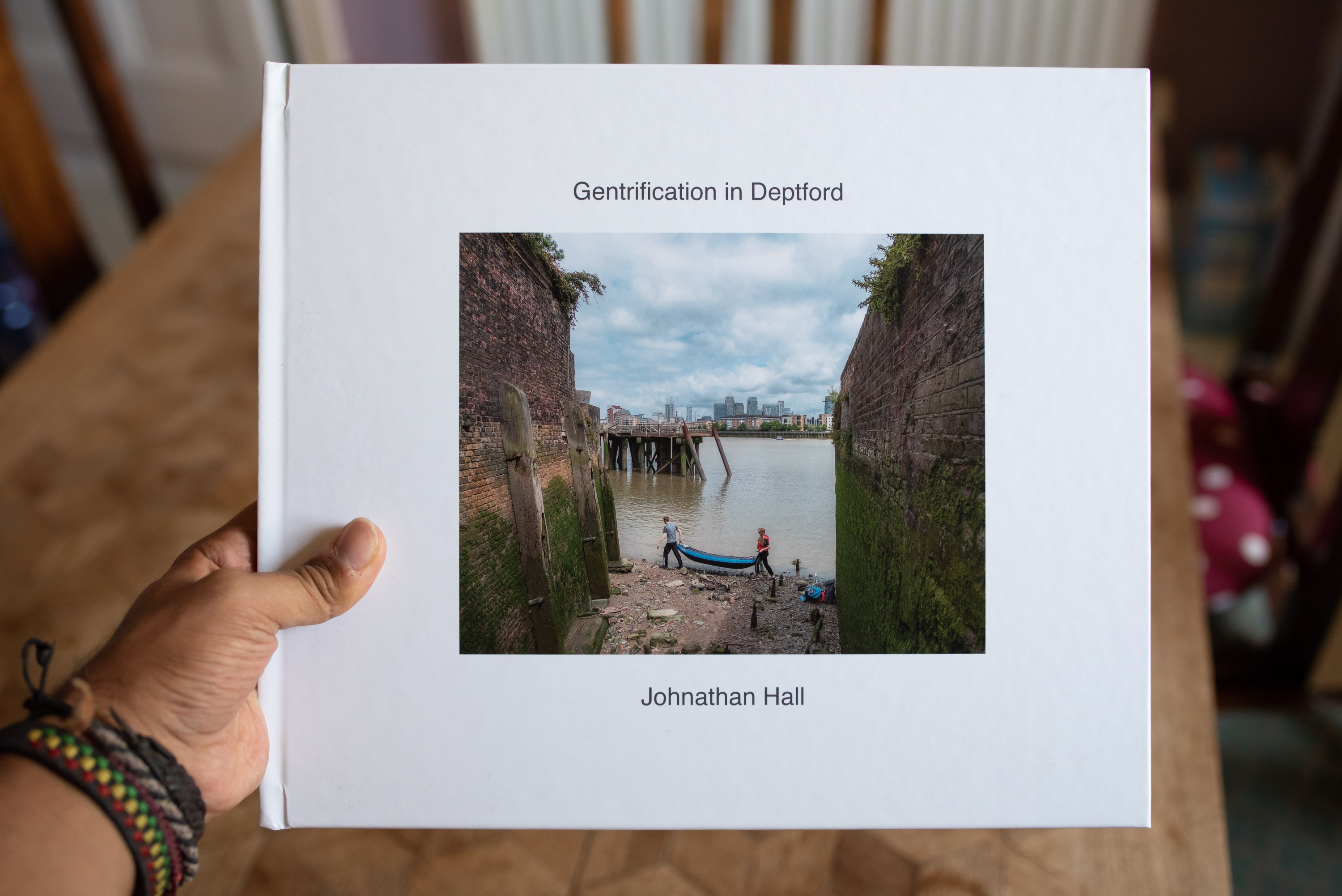
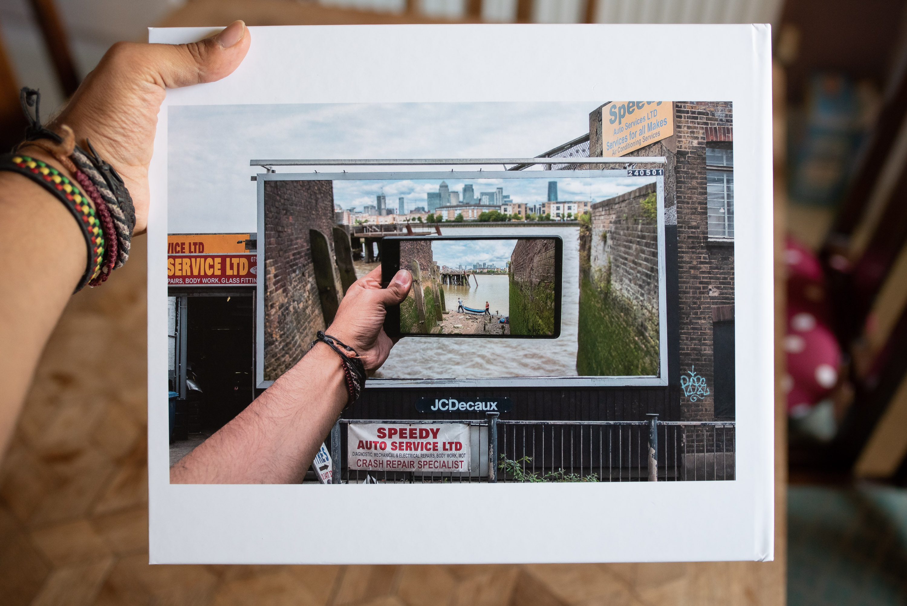
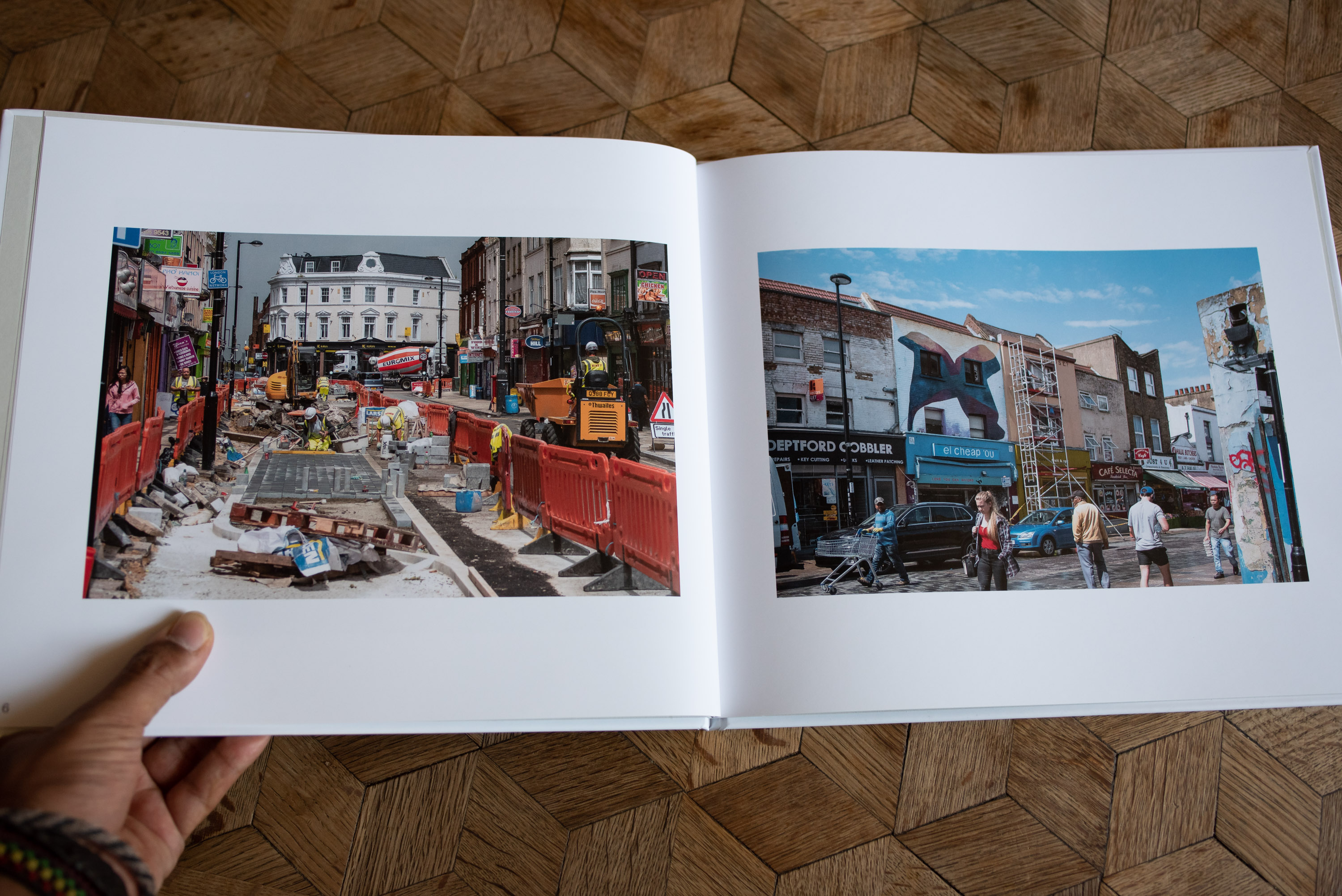
In contrast to the organic and rustic feel to the handmade book I produced for Assignment 1, I decided to employ a different production method for the book for Assignment 3. Although they were both books, they couldn’t in my opinion have been much more different and this was in order to purposefully reflect their respective assignments. The book for Assignment 3 was designed by myself but produced by an online book company so the finish to the book was quite a bit more professional and, incidentally, colder. This professional, cold feel to the book was because there were basically no ‘mistakes’ or quirks to the production of the book; it being made probably by computer mostly. However, I was after this kind of feel to the book because it reflected from my perspective the process of gentrification in Deptford and also many of the photographs I’d taken depicting the gentrification process.
Front Cover of Gentrification in Deptford
I also designed and formatted the book to look professional, paying special attention to borders, text size and placement and colour choices throughout the book. Because the book is a revised edition of the PDF draft I produced initially for Assignment 3, I tried to listen to my tutor’s comments regarding presentation. Drawing upon his comments for both the PDF draft I’d produced for Assignment 3 as well as my original version of Assignment 5 – Tourism in London, and Me. By drawing upon both these sets of comments I feel I was better able to design a professional looking book. Aspects of the books design included a white, uniform colour scheme across the book (excluding photographs and text), all photographs appearing centrally in the page on a separate page and borders appearing uniform and spacious throughout the book.
Back Cover of Gentrification in Deptford
My reasoning for making the final presentation for Assignment 3 purposefully professional/cold was that I found through my Researching Gentrification in Deptford post gentrification can often be a process of vast change both positive and negative. People are often displaced or at the least the community changes drastically but lots more housing and a new scene develops. By keeping the look of the book neutral, I was accepting both sides to this argument and instead of taking a side to the argument, I was documenting the narrative of gentrification in Deptford.


