You Are Looking at Something That Never Occurred – Exhibition Visit

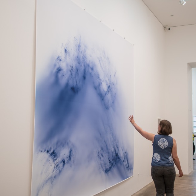
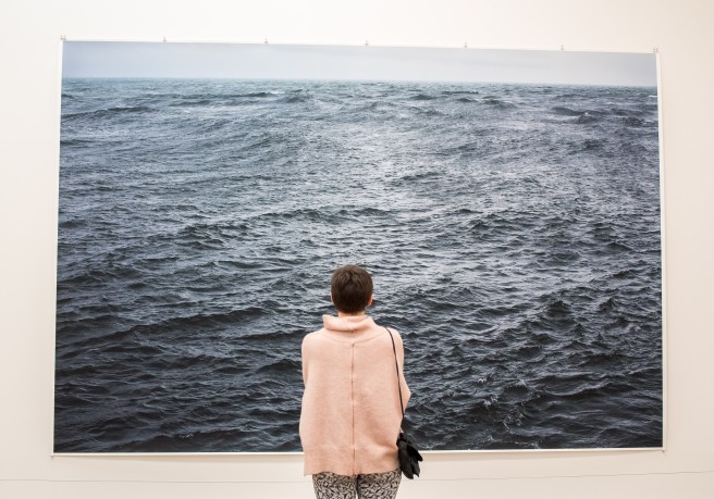
On 29/6/2017 I visited the Zabludowicz Collection to see an exhibition intriguingly called: ‘You Are Looking at Something That Never Occurred’. I found it intriguingly titled because when I find myself looking at something with my eyes then surely it must have occurred? I found the exhibition to be very immersive and I felt there was a definite theme to what I was seeing.

In the exhibition introduction was a section about looking beyond the ‘decisive moment’ and onto alternative strategies to engage audiences who find the image so prevalent nowadays. Instead it proposed a slower approach to photography including appropriation, staging and manipulation of images. I was interested by the exhibition’s claim as I myself had been looking for alternative strategies to differentiate my images and was anticipative that there could be a few approaches which would help me to think about my own work in new ways.

Some of Lucas Blalock's Work at the 'You Are Looking at Somethign That Never Occurred' Exhibition
Some of Lucas Blalock’s Work at the ‘You Are Looking at Somethign That Never Occurred’ Exhibition

A major impression I was left with when visiting the exhibition was the amount the artists on show tended to play with the photographic surface and our perceptions of it. Some examples of this were Sara Cwynar with Women, 2015 where she appropriated the rather famous Les Demoiselles D’Avignon, 1907 by Pablo Picasso and covered parts of it with her fingers. Not only did this create a new meaning to the work but also introduced an element of doubt for the viewer when it was rephotographed but with something (the artist’s fingers) between the photograph and the original artwork’s surface.

A Photograph of 'Women, 2015' - Sara Cwynar
A Photograph of ‘Women, 2015’ – Sara Cwynar

Another example was Erin Shirreff’s Signatures, 2011. Here Shirreff reduced her sculptures down to blocks of tone in her photographs of them but the feature which caught my eye in the photographs were the deliberate crease down the middle of the paper. In one photograph of a sculpture the crease is bent inwards while to is bent outwards with another photograph of a sculpture. This made me wonder whether this was intentional and if so whether it was a part of the work.

A Photograph of 'Signatures, 2011' - Erin Shirreff - Showing the Outward-facing Crease Down the Middle of the Photograph
A Photograph of ‘Signatures, 2011’ – Erin Shirreff – Showing the Outward-facing Crease Down the Middle of the Photograph

xxxxxxx, 2011 by Lucas Blalock creates a 3-dimensional looking photograph by ironically rubbing out using Photoshop the one thing in the photograph that would have given it a natural appearance of depth. It was a picture of a gingham backdrop with a plastic thing in front of it but he has since rubbed out the plastic thing. The rubbing out process created the 3-d effect on the fairly uniform gingham but Blalock sees this rubbing out process as not messing around with the photograph’s surface. Instead he is ‘not really thinking about manipulating an image as much as working in the sculptural space that the photograph proposes.’ – (Blalock, 2017). This interested me because I had always thought of image manipulation as being on the surface of that image.

A Photograph of 'xxxxxxx, 2011' - Lucas Blalock
A Photograph of ‘xxxxxxx, 2011’ – Lucas Blalock

Lastly, Wolfgang Tillmans experimented with creating the illusion that a flat surface had 3-dimenisonal objects coming out of it by curling the edges of a photographic print so that it appeared to be coming out of the flat surface on truth study centre Table XVIII, 2005 – (Tillmans, 2005). I noticed these images looked more 3-dimensional from certain angles inside the exhibition room it was presented in so I took my photograph of it from that sort of angle.

A Photograph of 'truth study centre Table XVIII, 2005' - Wolfgang Tillmans
A Photograph of ‘truth study centre Table XVIII, 2005’ – Wolfgang Tillmans

In other areas of the exhibition I was impressed by the large scale prints of Thomas Ruff and especially Andreas Gursky. Gursky’s Chicago Board of Trade II, 1999 impressed me because of the level of detail on a massive scale inside the Chicago board of trade taken from a high viewpoint. I wasn’t so sure about Jeff Wall’s installation: Still Creek, Vancouver, winter 2003, 2003. It was impressive in the light box but I couldn’t see much going on in the actual depiction of the scene apart from the graffiti on the walls leading up to the tunnel. When I learnt after the exhibition that he had previously shot the creek from a similar spot but with two children playing at the tunnel entrance many years previously, the installation made a lot more sense. It was almost as though Wall was appropriating his own work, allowing the viewer to imagine perhaps that the graffiti now present at the tunnel entrance had been put there by the children before. However, without seeing the previous shot from the similar spot, I wouldn’t have made the connection so I don’t think it worked as a singular piece of art.

A Photograph of Someone Taking a Photograph of 'Chicago Board of Trade II, 1999' - Andreas Gursky
A Photograph of Someone Taking a Photograph of ‘Chicago Board of Trade II, 1999’ – Andreas Gursky

Overall, I was pleased I visited the exhibition because it offered me the chance to see a lot of varied work by some contemporary photographers who’s process of photographing was much more deliberate. This suited my own style of photography somewhat I felt and there was a lot I saw I could learn from.

A Photograph of Jeff Wall's Installation - 'Still Creek, Vancouver, winter 2003, 2003'
A Photograph of Jeff Wall’s Installation – ‘Still Creek, Vancouver, winter 2003, 2003’

References:

You Are Looking at Something That Never Occurred [Exhibition] 30th Mar – 9th Jul 2017. Zabludowicz Collection, London.

Wolfgang Tillmans: 2017

Today (the last day the exhibition was on!) I decided to make a trip to the Tate Modern to see the Wolfgang Tillmans: 2017 exhibition.

Looking at a Photograph of a Dismantled Printer

I found the exhibition which I considered as a journey through his mind a thoroughly enjoyable experience and I didn’t really want it to end! There were many features of the exhibition which made it interesting for me but one which stood out was the presentation. As mentioned I considered it a journey through Wolfgang Tillmans’ mind and I felt the haphazard yet semi-organised layout could perhaps reflect the nature of his mind. This was further illustrated by the sticking or clipping of certain photographs to the wall while others were more conventionally framed. I gleaned from this that the framed ones might constitute more something of more importance to TIllmans or at least that they were more structured in his head. The same could also be said of the size of the prints, some of which were huge and filled most of the not insubstantial walls. Another aspect of the exhibition’s layout was the use of vitrines which I saw as adding even more depth to the exhibition. In some ways I liked the fact Tillmans had left the viewer to decide for themselves what the exhibition’s photographs were about because there was practically no information in the rooms. However, an exhibition handout explaining the photographs was on request.

Two People Looking at Two of Wolfgang Tillmans's Prints
Two People Looking at Two of Wolfgang Tillmans’s Prints

The often intimate documentation process was like a visual diary with a very honest and even democratic insight into Tillmans own life. I felt like I could learn from this for personal projects where he was seemingly indiscriminate of what he included in the camera’s view.

A Person Looking at a Portrait by Wolfgang Tillmans
Two People Looking at a Portrait by Wolfgang Tillmans

The majority of his work was in colour which was interesting to me. I felt the use of colour kept the photos more contemporary and immediate (and for the ones with political messages more topical). Although I felt he didn’t explicitly take advantage of colour like with colour relationships, the use of colour allowed him to be more personal and of course add vibrancy to the majority of photos. Having said that, one photograph caught my eye where he found the same colour palette of pink/purple and so used colour to his advantage there.

An Example of Where I Felt Tillmans Used Colour Well
Someone from the Tate Looking at a Photograph of Static

One area of the exhibition I felt was a bit self-indulgent initially (the accolades he had accumulated in a room of vitrines), came to grow on me if you were to take on board my assertions that Tillmans was taking you on a journey through his mind. In many people’s heads I imagine there would be a space for work you are proud of and would like to flaunt and Tillmans did so in this room. Likewise there was a room of portraits which I assumed had some significance to Tillmans which he had decided to share on a large scale. Nearby in the previous room there was a set of prints – portraits of people which for some reason had been printed much smaller but in a grid. I assumed this was people he had met more briefly and so were of less importance to him in his mind.

People Looking at the Exhibition Vitrines

The thing I came away was a sense of Tillmans as a sensitive person who was highly aware of his surroundings and who wasn’t afraid to document his life for all to see and share it in some (very) big prints. One subject Tillmans addressed in his work was that of our perception of the modern world and when I was reading a review of Tillmans’ exhibition at the Tate Modern, I read a section that encapsulated what this might mean for him. The article was by the Guardian and the bit that caught my eye read: ‘In its shifting, mutating, circling inconstancy – and in its dynamic liveliness – this art reflects the condition of life itself. Until it ends, Tillmans’s enterprise must always be a work in progress, more seen and more shown by the day.’ – (Cumming, 2017). I felt this description mirrored what I saw in the exhibition and the modern climate for image sharing being prevalent throughout society.

A Person at the Exhibition Looking at a Photograph of a Photograph Being Transformed into a Physical Object
I Felt the Illusion Was More Powerful in This Second, Similar Photograph
Someone 'Reaching Out' for One of Wolfgang Tillmans's Prints!
Someone ‘Reaching Out’ for One of Wolfgang Tillmans’s Prints!
A Person Looking at a Massive Print by Wolfgang Tillmans

References:

Cumming, L. (2017). Wolfgang Tillmans: 2017; Eduardo Paolozzi review – from the chaos of time. [online] the Guardian. Available at: https://www.theguardian.com/artanddesign/2017/feb/19/wolfgang-tillmans-2017-review-tate-modern-eduardo-paolozzi-whitechapel-gallery [Accessed 13 Jun. 2017].

Wolfgang Tillmans: 2017 [Exhibition] 15th Feb – 11 Jun 2017. Tate Modern, London.