After correspondence with my tutor in the pre-assessment review (Assignment 6) and some thinking on my part, I have essentially rearranged the presentation of Assignment 5. This is so it is possible to read the project in a different way than had it been left as it was presented in the original book format. Instead I’ve presented each main piece as a separate standalone photograph. Beside each standalone photograph is a supporting document. The original introduction for the project remains largely accurate:
I have been documenting the picture-taking, particularly selfie-happy tourists who frequent London. The way I have decided to do this isn’t an accurate rendition of the scene as the photographs are no longer indexical to what was in front of the camera. Instead, I have utilised digital technologies to merge parts of multiple images into single composites. One of the conditions of optical perception inherent in photography (Eco, n.d.) is reduced (that of juxtapositions within the frame derived from the indexical relationship of the scene and the photograph in traditional photography). However, another is given for these particular scenes. Here at these tourist hotspots I’ve created a more accurate sense of what it is like to be in these magnets for tourists with selfies being taken left, right and centre. The clutter has been removed allowing the viewer to be more immersed in what has to me become more of a spectacle than the landmarks themselves. That is the spectacle of the spectacle – the unconscious performance by tourists of mass picture-taking from similar viewpoints with myself recording this spectacle in a cohesive manner. ‘The spectacle that falsifies reality is nevertheless a real product of that reality’ – (Debord, 1967). I would argue this quote could be applied to the composites I’ve created which have been drawn from reality.
I’ve taken the images from the perspective of an outsider looking in, even though I would call myself more of an insider as this is my home city. To support the single image composites I have repeated the images produced for each hotspot with myself imitating the tourists’ poses in front of the landmarks. ‘real life is materially invaded by the contemplation of the spectacle, and ends up absorbing it and aligning itself with it.’ – (Debord, 1967). I wanted to establish my own relationship to the tourists. This was that materially there was no relationship but within the pseudo-world of images I could assert my presence. This represents myself interacting with the tourists retrospectively. I have previously noted that tourists tend to reassure themselves when in unfamiliar places by simply taking pictures. Susan Sontag writes on tourism: ‘As photographs give people an imaginary possession of a past that is unreal, they also help people to take possession of a space in which they are insecure.’ – (Sontag, 1977). Using this line of thinking, just like the tourists picture-taking at the hotspots were doing as a kind of souvenir of their experience as outsiders looking in, I also used picture-taking as an outsider looking in, except the subject of my pictures were the tourists and their performance in front of the landmarks. My picture-taking too was a kind of reaction towards something I felt slightly unsure about.
Finally for this project, I took selfies and photos similar to what the tourists would have taken from the same position they (and I, retrospectively) had assumed in the composites I’d put together. For me this reaffirmed my experience in relation to the tourists; producing something tangible from a relationship I’d never been able to put my fingers on up until now.
Photograph 1 – Assignment 5 – Tourism in London, And MeSupporting Document for Photograph 1 – Assignment 5 – Tourism in London, And MePhotograph 2 – Assignment 5 – Tourism in London, And MeSupporting Document for Photograph 2 – Assignment 5 – Tourism in London, And MePhotograph 3 – Assignment 5 – Tourism in London, And MeSupporting Document for Photograph 3 – Assignment 5 – Tourism in London, And MePhotograph 4 – Assignment 5 – Tourism in London, And MeSupporting Document for Photograph 4 – Assignment 5 – Tourism in London, And MePhotograph 5 – Assignment 5 – Tourism in London, And MeSupporting Document for Photograph 5 – Assignment 5 – Tourism in London, And MePhotograph 6 – Assignment 5 – Tourism in London, And MeSupporting Document for Photograph 6 – Assignment 5 – Tourism in London, And MePhotograph 7 – Assignment 5 – Tourism in London, And MeSupporting Document for Photograph 7 – Assignment 5 – Tourism in London, And Me
References:
Debord, G. (1967). Society of the Spectacle. 3rd ed. London: Rebel Press, pp. 7-8.
Eco, U. (n.d.) In. Burgin, V. (1982) Thinking About Photography. London: MacMillan.
Sontag, S. (1977). On Photography. New York: Farrar, Straus and Giroux, pp. 12.
Does the type of aesthetic approach employed by the photographer affect the way a photograph is read by an audience?
Aesthetics are a key attribute of a photograph. They affect the reader’s gaze and so photographers are faced with the question of whether to make their photographs aesthetically-pleasing or not aesthetically-pleasing. I have juggled between the beautiful (which I find aesthetically-pleasing) and ‘gritty’ (which I find truer-to-life but not aesthetically-pleasing). What constitutes ‘aesthetically-pleasing’ or ‘not aesthetically pleasing’ is a very subjective topic though. What might be a beautiful for some might be ugly for others. Likewise, what may be gritty for some might be enchanting for others. This disparity is due to the fact that each viewer’s taste for pleasing aesthetics varies. ‘Judging beauty and other aesthetic qualities of photographs is a highly subjective task.’ – (Datta, Joshi, Li, Wang, 2006). Although this is a subjective task, by using a computational approach it has been possible to see ‘there exist certain visual properties which make photographs, in general, more aesthetically beautiful.’ – (Datta, Joshi, Li, Wang, 2006). Therefore although aesthetics are subjective, they do conform somewhat to a standard. It is our natural inclination to make aesthetically-pleasing photographs too: ‘Except for those situations in which the camera is used to document, or to mark social rites, what moves people to take photographs is finding something beautiful.’ – (Sontag, 1977). The intended usage of the photograph is one factor to take into account because it can dictate whether a photograph is used to document or to find something beautiful.
Certain photographers combine these two disciplines (documenting and finding something beautiful) to express powerfully their vision and one such photographer is Sebastião Salgado. ‘In their strong formal design, Salgado’s pictures revive photographic modernism with its emphasis on geometry and visual contrast. Beauty is pressed into the service of an old-fashioned humanism…’ – (Stallabrass, 1997). This description of his photographic approach shows Salgado’s strong aesthetics but also hints at his moral code when taking these photographs. Although he has been very successful in his projects, he has also been criticised by some for the beauty inherent in even his most haunting photojournalistic photographs. One prominent critic of Salgado’s ‘aestheticisation’ of suffering was Ingrid Sischy. She argued that ‘this beautification of tragedy results in pictures that ultimately reinforce our passivity toward the experience they reveal.’ – (Sischy, 1991). By combining documenting something factual with the aestheticisation of these facts, Salgado is in fact detracting from the photographs’ message in terms of their power to portray the truth of what they depict.
I would agree on a base level that the viewer of such photographs (Salgado’s beautiful documents) is more likely to be distracted from the message because of the aesthetics than had the photographs simply aimed to portray ‘the truth’. Although the photographer’s intentions might be honest, it is easy with photography to let aesthetics get in the way of truth. For example with Fig. 1, (Mraz, 2002) makes the point that: ‘The photo’s psychological tone is set by the solemn expressions on the children’s faces and their prostration on the floor’. In my eyes though the ethereal lighting from solely the open doorway with the strong tones of light and dark created from this (especially on the bones themselves) capture and divert my attention for far longer. However, I would also then suggest the critic of such an argument – that Salgado’s aesthetics distract from the message – is missing a vital point. Salgado’s projects clearly reach a great audience and in this regard at least he has been successful. If his works’ aesthetics were not so powerful and beautiful would his work have reached so massive an audience? Therefore perhaps Salgado is looking at the wider picture in so far as getting a message across, even if it means aestheticising the facts.
So far I have only been concerned with superficial aesthetics of photography as this is the foremost feature people get to when looking at photographs. Photographs can also be regarded as beautiful beneath their outward appearance and I would assert that this gives such photographs more liability to possess deeper meaning once the message has been uncovered. A photographer I have recently been to an exhibition of: Thomas Ruff springs to mind as an example where the work is not immediately beautiful (at least to my eye) but instead the viewer has to read into the work to find beautiful meanings within the work. One of his most famous projects: Portraits 1986-1991 (see Fig. 2) employs several strategies to enable the viewer to find meaning within the work which I myself found beautiful. Showing Fig. 2 in this size on my blog felt like I was doing a disservice to the impact the enormous print has on the viewer when looking at it in a gallery. On the other hand the superficial aesthetics were not particularly pleasing to the eye; the lighting was quite flat and at first glance it seemed quite bland. Interestingly, this could be exactly the kind of reason Ruff employed such aesthetics – getting across the meaning in part to me as a reader of the portraits. Looking at Ruff’s Portraits 1986-1991 again, they did grow on me as the lighting is quite soft in fact yet shows off all the features of each sitters’ face. The photographs depicting the blank expressions of people Ruff knew from those years give away nothing, because ’even though they show every detail of the skin, clothes, and hair of the sitter, they still don’t try to show any of his or her feelings’ – (Blank and Ruff, 2004). This is a kind of paradox but an effective one because by giving away nothing superficially, the viewer inevitably begins to wonder about the bigger picture. Scale is also part of the ruse where Ruff produces these massive prints of vacant faces, enticing the viewer to wonder why they are printed so monumentally big when they are just like passport pictures. Unearthing the message beneath – for me it was that the passport style pictures allow the viewer their own interpretation of the sitter which is ultimately a contrived one – was a rewarding experience.
Although I picked up on this meaning somewhat by myself I still had to back up my assertions from another source – ‘a portrait by Ruff looks like a very large passport photograph. … Any personality a sitter may have is there because you, the viewer, have projected your own feelings and prejudices on to the image.’ – (Dorment, 2003). In my opinion this gaining of understanding, while rewarding, is also less immediate and has less widespread ‘appeal’ than the superficially beautiful work of for example Salgado. Because the reader has to search for the beauty embedded inside rather than on the surface, more casual readers may not bother gaining understanding from work like Ruff’s, where the aesthetics are imbued within. Looking at this from an aesthetic point of view it would be possible to argue that both draw from the vernacular: Ruff playing upon it intentionally by taking all the ‘accidental’ elements out of the traditional vernacular and using them to his advantage like with his Portraits 1986-1991 project (see Fig. 2). On the other hand, Salgado employs telling juxtapositions (like the children juxtaposed with the bones in Fig. 1 and combines this with selective framing and often dramatic, otherworldly lighting. All of this becomes unified because Salgado continues to utilise the black and white medium. Although this might seem like the opposite of traditional vernacular imagery (where colourful, seemingly accidental snapshots are prevalent), looking closer it seems Salgado has culminated the ingredients of the vernacular into a more sophisticated version.
Fig. 3. Photograph 4 – Assignment 3 – Documentary
I have until recently always given slight precedence to the superficial aesthetics attribute of my photography and in part it has defined the images I’ve produced for my projects. In hindsight this was perhaps an attempt to move it away from the vernacular type imagery pervading social media. With Assignment 3 – Documentary (see Fig. 3) I turned my attention away from my inward battle between superficial aesthetics and meaning. Instead I put my efforts into telling a convincing story; letting meaning come first and putting aesthetics to the side. Interestingly I found they were still linked as the aesthetics when consistent, combined to tell a more immersive story. However, I noticed certain photographers disregarded superficial aesthetics altogether or even deliberately to make them gritty such as Daido Moriyama.
Moriyama at the time he was taking photos on the streets of Tokyo (in the 1960s) prescribed like the group of left-wing photographers he joined to a style developed to break away from aesthetic conventions of a ‘good’ photograph found in European and American photography. They instead employed an aesthetic that ‘was identified with the expression are, bure, boke – grainy, blurry and out of focus, in reference to the three main characteristics that distinguished the group’s images’ – (Scaldaferri , 2017). Moriyama’s reasoning for using such gritty aesthetics (see Fig. 4) was that he was ‘Refusing the idea that the photographic medium could only be used to produce archival documents,’ instead ‘putting an accent on its image-making capability’ – (Scaldaferri , 2017). He thereby used the aesthetics of are, bure, boke as a conduit to express his opinions about the state of Tokyo’s dark streets at that time.
Later, after Provoke, Moriyama published Bye Bye Photography (1972). Bye Bye Photography used the same are, bure, boke aesthetics but offered even less of a sense of subject matter throughout the book. Instead it became more introspective in terms of it attempting to deconstruct photography and I found worked better as a kind of flowing text rather than looking at each image singularly. Therefore Bye Bye Photography used consistent aesthetics both superficial and otherwise as a tool to challenge the medium of photography – ‘attempt to deconstruct the medium in [Moriyama’s] series Shashin yo sayonara (Farewell Photography) (1972), though it ultimately deconstructed him.’ – (SFMOMA , 2016). This again shows the importance of consistent aesthetics even though in this instance the result was so destructive.
Moriyama was and remains very popular, influencing other photographers and young people especially in Japan: ‘The older generation appreciates a lot of Daido’s work, but right now he is very, very popular among young people’ – (Uematsu, 2012). However, the appeal of his work is not as widespread (outside of Japan) as say Salgado. I would argue this is because it is necessary with Moriyama’s work (like Ruff’s Portraits 1986-1991) to look further beyond the superficial, which acts as just an (aesthetically-consistent) gateway to the meaning found within. What I could see influencing me from Moriyama’s work would be the understanding that the process of making an image can be far more important in terms of reflexivity conveyed in this process than the aesthetic. Having said this, Moriyama clearly intends to go consistently for the ‘are, bure, boke’ look. For me this deliberation could be because his work transcends the traditional vernacular with the choice of are, bure, boke black and white medium as a consistent aesthetic with reflexive meaning caught across these frames.
Conclusion:
While it may be true that photographs with gritty superficial aesthetics are not as accessible as work which conforms to our standard taste for the beautiful, often there is a space for deeper meaning to be accessed by the viewer in the work. This could be whether it is intended by the photographer – by playing upon the vernacular – or not. As long as the work is consistent too the viewer may gain more from a set of photographs than a singular, glorified image. Also it may well be important to the photographer to display reflexivity in their photographs which in itself could be considered beautiful. In a funny kind of way photographic projects with aesthetics that don’t conform to a standard taste for the beautiful have more art value than work which doesn’t play on the vernacular or is less emotional. All of this depends on what kind of impact the photographer wishes to make and to what type of audience.
‘something considered beautiful conforms to a standard taste, whereas something considered as ugly may confront our present sensibility and bring out a new one.’ – (Fontcuberta and Feustel, 2010). While this quote by Joan Fontcuberta when talking about beauty shows that a deeper meaning or even new sensibilities may be brought out when we are faced with work that is not superficially beautiful, I would suggest it tends to lose the widespread appeal that comes from conforming to our (natural) taste for the beautiful. Yet I would also make the point that confronting our current sensibility and potentially bringing out a new sensibility may be more important to many photographers/artists. This would be especially true considering the current climate of image making where social media platforms are over saturated with similar images that conform to our standard taste for the beautiful.
Word Count:
2,168 (Including Quotes)
References:
Blank, G. and Ruff, T. (2004). Gil Blank and Thomas Ruff in Conversation. Influence, (2), p.51.
Datta R., Joshi D., Li J., Wang J.Z. (2006) Studying Aesthetics in Photographic Images Using a Computational Approach. In: Leonardis A., Bischof H., Pinz A. (eds) Computer Vision – ECCV 2006. ECCV 2006. Lecture Notes in Computer Science, vol 3953. Springer, Berlin, Heidelberg, (10) pp.288-289.
Uematsu, E. (n.d.). In. Birmingham, L. (2012). “Labyrinth” by Daido Moriyama: Contacting the Urban Jungle. [online] Lucybirmingham.com. Available at: http://lucybirmingham.com/?p=1502 [Accessed 7 Jan. 2018].
I have edited my critical review which can be seen below with the changes made marked in red. The reasoning for the changes made can be found here.
Does the type of aesthetic approach employed by the photographer affect (1) the way a photograph is read by an audience?
Aesthetics are a key attribute of a photograph. They affect the reader’s gaze and so photographers are faced with the question of whether to make their photographs aesthetically-pleasing or (2) not aesthetically-pleasing. I have juggled between the beautiful (which I find aesthetically-pleasing) and ‘gritty’ (which I find truer-to-life but not aesthetically-pleasing). What constitutes ‘aesthetically-pleasing’ or ‘not aesthetically pleasing’ is a very subjective topic though. (2) What might be a beautiful for some might be ugly for others. Likewise, what may be gritty for some might be enchanting for others. This disparity is due to the fact that each viewer’s taste for pleasing aesthetics varies. ‘Judging beauty and other aesthetic qualities of photographs is a highly subjective task.’ – (Datta, Joshi, Li, Wang, 2006). Although this is a subjective task, by using a computational approach it has been possible to see ‘there exist certain visual properties which make photographs, in general, more aesthetically beautiful.’ – (Datta, Joshi, Li, Wang, 2006). Therefore although aesthetics are subjective, they do conform somewhat to a standard. It is our natural inclination to make aesthetically-pleasing photographs too: ‘Except for those situations in which the camera is used to document, or to mark social rites, what moves people to take photographs is finding something beautiful.’ – (Sontag, 1977). The intended usage of the photograph is one factor to take into account because it can dictate whether a photograph is used to document or to find something beautiful.
Certain photographers combine these two disciplines (documenting and finding something beautiful) to express powerfully their vision and one such photographer is Sebastião Salgado. ‘In their strong formal design, Salgado’s pictures revive photographic modernism with its emphasis on geometry and visual contrast. Beauty is pressed into the service of an old-fashioned humanism…’ – (Stallabrass, 1997). This description of his photographic approach shows Salgado’s strong aesthetics but also hints at his moral code when taking these photographs. Although he has been very successful in his projects, he has also been criticised by some for the beauty inherent in even his most haunting photojournalistic photographs. One prominent critic of Salgado’s ‘aestheticisation’ of suffering was Ingrid Sischy. She argued that ‘this beautification of tragedy results in pictures that ultimately reinforce our passivity toward the experience they reveal.’ – (Sischy, 1991). By combining documenting something factual with the (3) aestheticisation of these facts, Salgado is in fact detracting from the photographs’ message in terms of their power to portray the truth of what they depict.
I would agree on a base level that the viewer of such photographs (Salgado’s beautiful documents) is more likely to be distracted from the message because of the aesthetics than had the photographs simply aimed to portray ‘the truth’. (4) Although the photographer’s intentions might be honest, it is easy with photography to let aesthetics get in the way of truth. For example with Fig. 1, (Mraz, 2002) makes the point that: ‘The photo’s psychological tone is set by the solemn expressions on the children’s faces and their prostration on the floor’. In my eyes though the ethereal lighting from solely the open doorway with the strong tones of light and dark created from this (especially on the bones themselves) capture and divert my attention for far longer. However, I would also then suggest the critic of such an argument – that Salgado’s aesthetics distract from the message – is missing a vital point. Salgado’s projects clearly reach a great audience and in this regard at least he has been successful. If his works’ aesthetics were not so powerful and beautiful would his work have reached so massive an audience? Therefore perhaps Salgado is looking at the wider picture in so far as getting a message across, even if it means aestheticising the facts.
So far I have only been concerned with superficial aesthetics of photography as this is the foremost feature people get to when looking at photographs. Photographs can also be regarded as beautiful beneath their outward appearance and I would assert that this gives such photographs more liability to possess deeper meaning once the message has been uncovered. A photographer I have recently been to an exhibition of: Thomas Ruff springs to mind as an example where the work is not immediately beautiful (at least to my eye) but instead the viewer has to read into the work to find beautiful meanings within the work. One of his most famous projects: Portraits 1986-1991 (see Fig. 2) employs several strategies to enable the viewer to find meaning within the work which I myself found beautiful. Showing Fig. 2 in this size on my blog felt like I was doing a disservice to the impact the enormous print has on the viewer when looking at it in a gallery. On the other hand the superficial aesthetics were not particularly pleasing to the eye; the lighting was quite flat and at first glance it seemed quite bland. (5) Interestingly, this could be exactly the kind of reason Ruff employed such aesthetics – getting across the meaning in part to me as a reader of the portraits. Looking at Ruff’s Portraits 1986-1991 again, they did grow on me as the lighting is quite soft in fact yet shows off all the features of each sitters’ face. The photographs depicting the blank expressions of people Ruff knew from those years (6) give away nothing, because ’even though they show every detail of the skin, clothes, and hair of the sitter, they still don’t try to show any of his or her feelings’ – (Blank and Ruff, 2004). This is a kind of paradox but an effective one because by giving away nothing superficially, the viewer inevitably begins to wonder about the bigger picture. Scale is also part of the ruse where Ruff produces these massive prints of vacant faces, enticing the viewer to wonder why they are printed so monumentally big when they are just like passport pictures. Unearthing the message beneath – for me it was that the passport style pictures allow the viewer their own interpretation of the sitter which is ultimately a contrived one – was a rewarding experience.
Although I picked up on this meaning somewhat by myself I still had to back up my assertions from another source – ‘a portrait by Ruff looks like a very large passport photograph. … Any personality a sitter may have is there because you, the viewer, have projected your own feelings and prejudices on to the image.’ – (Dorment, 2003). In my opinion this gaining of understanding, while rewarding, is also less immediate and has less widespread ‘appeal’ than the superficially beautiful work of for example Salgado. Because the reader has to search for the beauty embedded inside rather than on the surface, more casual readers may not bother gaining understanding from work like Ruff’s, where the aesthetics are imbued within. Looking at this from an aesthetic point of view it would be possible to argue that both draw from the vernacular: Ruff playing upon it intentionally by taking all the ‘accidental’ elements out of the traditional vernacular and using them to his advantage like with his Portraits 1986-1991 project (see Fig. 2). On the other hand, Salgado employs telling juxtapositions (like the children juxtaposed with the bones in Fig. 1 and combines this with selective framing and often dramatic, otherworldly lighting. All of this becomes unified because Salgado continues to utilise the black and white medium. Although this might seem like the opposite of traditional vernacular imagery (where colourful, seemingly accidental snapshots are prevalent), looking closer it seems Salgado has culminated the ingredients of the vernacular into a more sophisticated version.
Fig. 3. Photograph 4 – Assignment 3 – Documentary
I have until recently always given slight precedence to the superficial aesthetics attribute of my photography and in part it has defined the images I’ve produced for my projects. In hindsight this was perhaps an attempt to move it away from the vernacular type imagery pervading social media. With Assignment 3 – Documentary (see Fig. 3) I turned my attention away from my inward battle between superficial aesthetics and meaning. Instead I put my efforts into telling a convincing story; letting meaning come first and putting aesthetics to the side. Interestingly I found they were still linked as the aesthetics when consistent, combined to tell a more immersive story. However, I noticed certain photographers disregarded superficial aesthetics altogether or even deliberately to make them gritty such as Daido Moriyama.
Moriyama at the time he was taking photos on the streets of Tokyo (in the 1960s) prescribed like the group of left-wing photographers he joined to a style developed to break away from aesthetic conventions of a ‘good’ photograph found in European and American photography. They instead employed an aesthetic that ‘was identified with the expression are, bure, boke – grainy, blurry and out of focus, in reference to the three main characteristics that distinguished the group’s images’ – (Scaldaferri , 2017). Moriyama’s reasoning for using such gritty aesthetics (see Fig. 4) was that he was ‘Refusing the idea that the photographic medium could only be used to produce archival documents,’ instead ‘putting an accent on its image-making capability’ – (Scaldaferri , 2017). He thereby used the aesthetics of are, bure, boke as a conduit to express his (7) opinions about the state of Tokyo’s dark streets at that time.
(7) Later, after Provoke, Moriyama published Bye Bye Photography (1972). Bye Bye Photography used the same are, bure, boke aesthetics but offered even less of a sense of subject matter throughout the book. Instead it became more introspective in terms of it attempting to deconstruct photography and I found worked better as a kind of flowing text rather than looking at each image singularly. Therefore Bye Bye Photography used consistent aesthetics both superficial and otherwise as a tool to challenge the medium of photography – ‘attempt to deconstruct the medium in [Moriyama’s] series Shashin yo sayonara (Farewell Photography) (1972), though it ultimately deconstructed him.’ – (SFMOMA , 2016). This again shows the importance of consistent aesthetics even though in this instance the result was so destructive.
Moriyama was and remains very popular, influencing other photographers and young people especially in Japan: ‘The older generation appreciates a lot of Daido’s work, but right now he is very, very popular among young people’ – (Uematsu, 2012). However, the appeal of his work is not as widespread (outside of Japan) as say Salgado. (8) I would argue this is because it is necessary with Moriyama’s work (like Ruff’s Portraits 1986-1991) to look further beyond the superficial, which acts as just an (aesthetically-consistent) gateway to the meaning found within. What I could see influencing me from Moriyama’s work would be the understanding that the process of making an image can be far more important in terms of (9) reflexivity conveyed in this process than the aesthetic. Having said this, Moriyama clearly intends to go consistently for the ‘are, bure, boke’ look. For me this deliberation could be because his work transcends the traditional vernacular with the choice of are, bure, boke (9) black and white medium as a consistent aesthetic with reflexive meaning caught across these frames.
Conclusion:
While it may be true that photographs with gritty superficial aesthetics are not as accessible as work which conforms to our standard taste for the beautiful, often there is a space for deeper meaning to be accessed by the viewer in the work. This could be whether it is intended by the photographer – by playing upon the vernacular – or not. As long as the work is consistent too the viewer may gain more from a set of photographs than a singular, glorified image. Also it may well be important to the photographer to display (9) reflexivity in their photographs which in itself could be considered beautiful. In a funny kind of way photographic projects with aesthetics that don’t conform to a standard taste for the beautiful have more art value than work which doesn’t play on the vernacular or is less emotional. All of this depends on what kind of impact the photographer wishes to make and to what type of audience.
‘something considered beautiful conforms to a standard taste, whereas something considered as ugly may confront our present sensibility and bring out a new one.’ – (Fontcuberta and Feustel, 2010). While this quote by Joan Fontcuberta when talking about beauty shows that a deeper meaning or even new sensibilities may be brought out when we are faced with work that is not superficially beautiful, I would suggest it tends to lose the widespread appeal that comes from conforming to our (natural) taste for the beautiful. Yet I would also make the point that confronting our current sensibility and potentially bringing out a new sensibility may be more important to many photographers/artists. This would be especially true considering the current climate of image making where social media platforms are over saturated with similar images that conform to our standard taste for the beautiful.
Word Count:
2,168 (Including Quotes)
References:
(10) Blank, G. and Ruff, T. (2004). Gil Blank and Thomas Ruff in Conversation. Influence, (2), p.51.
Datta R., Joshi D., Li J., Wang J.Z. (2006) Studying Aesthetics in Photographic Images Using a Computational Approach. In: Leonardis A., Bischof H., Pinz A. (eds) Computer Vision – ECCV 2006. ECCV 2006. Lecture Notes in Computer Science, vol 3953. Springer, Berlin, Heidelberg, (10) pp.288-289.
Uematsu, E. (n.d.). In. Birmingham, L. (2012). “Labyrinth” by Daido Moriyama: Contacting the Urban Jungle. [online] Lucybirmingham.com. Available at: http://lucybirmingham.com/?p=1502 [Accessed 7 Jan. 2018].
Following on from the comments from my tutor for Assignment 3, I have created a photo book in which I have paid special attention to formatting and text layouts. I feel I have learnt from the comments my tutor made regarding the formatting of the original (photo book) version of Assignment 5 where the photos felt too cramped on the pages.
Additionally I have removed any captioning of the photographs in the book so that the viewer can let themselves find the narrative occurring within the photographs. I also added a section to the book to show more images of the gentrification process in Deptford.
Lastly I removed one of the images from the project – the one I originally captioned ‘A Vibrant Scene’ as I agreed with my tutor it was a somewhat redundant image.
Having lived near Deptford for many years now, I have witnessed massive changes in the area. Some of this has been quite gradual while recently there has been a more drastic change in appearance. The changes have, continue to and will affect Deptford and its people in profound ways and I believe it is important to document some of this changing Deptford from the perspective of a local inhabitant. In this project I aim to show the development from my point of view and how I perceive a gentrification process occurring.
Below I have attached the PDF version of the cover of the book:
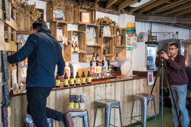
In light of my tutor’s comments regarding my original version of Assignment 1, I have made a significant change to the project, which I feel makes the project work as a whole a lot more. The change included replacing certain photographs with others from the initial shooting period or shooting certain photographs again so that the set established a more consistent viewpoint of the brewery. Specifically this entailed choosing a replacement photograph I’d already shot for Photograph 3 of my original version of Assignment 1. Also shooting again the final shot (Photograph 10) for the assignment which aimed to show the brewery doubling as a working bar. Both these replacement photographs avoided eye contact in the gaze between the photographed people and the viewer. This helped maintain the same unobtrusive perspective throughout the project so that each photograph was accordant with the next. Therefore the viewer was more likely to be immersed in the photographs of the brewery which was my initial intention.
In addition I wrote a different introduction to accompany the photographs which I felt better reflected the revised version and which I have subsequently turned into a handmade book:
My response to showing my engagement with my local community has been photographing a nearby brewery. More specifically my response has been photographing the people behind and connected to the brewery as they interact with it. I have used a focal length of 35mm throughout the project and have chosen to avoid eye contact with the camera for the people interacting with the brewery. This was to maintain a consistent aesthetic style and to look at the workings of the brewery from afar. I have displayed the photographs in this handmade book as I feel it reflects the organic feel to the brewery.


