Daido Moriyama at the Michael Hoppen Gallery and in the Exhibition: ‘Another Kind of Life’ at the Barbican

On the 27th March 2018 I visited the Michael Hoppen Gallery to see the Daido Moriyama exhibition there. This was a decision I’d made as I had written about Moriyama in some of my critical review. Although my critical review had been well received, my tutor had some comments concerning my observations about Moriyama’s work. Therefore I thought it would be a good opportunity to see some of Moriymama’s work in person. Then I could make informed amendments to my critical review based upon visiting the exhibition(s) in person.

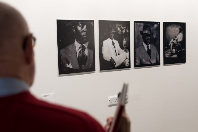
It seemed that subject was all important to Moriyama, however the high contrast, often grainy black and white medium could not be ignored. The photographs on show still clearly referenced the world they depicted but the overall effect for me was one of disoriented otherworldliness which the black and white medium helped to back up. Some of the photographs were sharp and quite clean (not much graininess) while the majority conformed to the ‘are, bure, boke’ – grainy, blurry and out of focus characteristics which defined the left-wing group of photographers Moriyama joined in the 1960s – (Scaldaferri, 2017). This inconsistency left me somewhat confused; while Moriyama was famous for appearing in the Provoke magazine for precisely these reasons (are, bure, boke), some of the photos in the exhibition went against this trend.

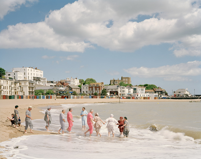
However, what did remain consistent was the high contrast evident in each photograph’s finish which was a trademark of Moriyama’s process. This as well as the disconcerting subject matter (stray dogs staring at the camera, seedy images from Tokyo’s underworld and grabs of American culture in Japan) tied the exhibition together into something weirdly satisfying.

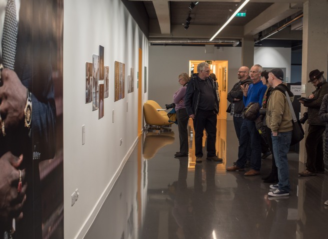
Then on the 10th May 2018 I took it upon myself to visit a larger exhibition in which Moriyama’s work appeared as a feature of many photographers’ work displayed together. The exhibition was at the Barbican and was called Another Kind of Life. I found the exhibition as a whole to be very interesting and eye-opening in places. I enjoyed some features more than others and the one which stood out most to me was Jim Goldberg’s Raised by Wolves. Here he used similar to my eyes strategies and techniques as his Open See exhibition.

When I arrived at Daido Moriyama’s Japan Photo Theatre section, I was surprised to find a very similar layout of the photographs and the way they were framed compared to the photographs in the Michael Hoppen Gallery. I realised later this was probably intentional as both exhibitions were on at the same time. However, I liked the way the frames were all black and they tessellated so that there were no gaps in between the photos. I found this style quite appealing and in my opinion went well with Moriyama’s high contrast, ore, bure, boke look. Again the photographs appeared as snapshots at first glance but the subjects and aesthetics pointed towards something different. Also I found within the context of Another Kind of Life exhibition the work fit in well as the viewer gained insight into the world of people on the margins.

© Daido Moriyama (1968) Nippon Gekijo Shashincho (Japan Theatre Photo Album) from the series Japan Photo Theatre

I had been aware of the popularity of Moriyama in Japan and that the had influenced a large number of young Japanese photographers. I was therefore pleased to see that another photographer appeared at Another Kind of Life who had been influenced by Moriyama. His name was Seiji Kurata. Although he had been influenced by Moriyama and it was black and white, I found his work to be very different aesthetically. It was much more considered at the time of shooting and the black and white treatment was much less harsh with less contrast. There was stilll lots of contrast but it contained grey midtones and things appeared sharper and more in focus. I liked the work of Kurata and thought he had managed to develop his own style, far from copying the aesthetics of Moriyama but instead using edgy subjects reminiscent of the person he was influenced by.

Seeing a variety of Moriyama’s work in person and some of the generation he influenced left me much more informed about the aesthetics and subject matter Moriyama concentrated on. His photographs were always edgy and the subject was paramount to his way of working. However, he had developed this edgy, distinctive high contrast black and white aesthetic which for me reflected well the state of mind he was in as he roamed the streets of Tokyo looking for a subject which captured his imagination.

References:

Another Kind of Life: Photography on the Margins (2018). Barbican Art Gallery [Exhibition] 28 Feb – 27th May 2018.

Daido Moriyama (2018). Michael Hoppen Gallery [Exhibition] 22 Feb – 7th Apr 2018.

Scaldaferri, G. (2017). Discover The Captivating Work Of Acclaimed Japanese Photographer, Daido Moriyama. [online] Culture Trip. Available at: https://theculturetrip.com/asia/japan/articles/daido-moriyama-the-father-of-street-photography-in-japan/ [Accessed 16 May. 2018].

Simon Roberts – Merrie Albion – Landscape Studies of a Small Island – Study Visit – 10/3/2018

I took it upon myself to make a study visit on 10th March 2018 to see Simon Roberts’ Merrie Albion exhibition on the last day it was open! I am glad I did because it made me realise a few things about Roberts’ approach (by seeing his massive prints in person) that I hadn’t completely grasped when I wrote a post about We English a while ago.

Merrie Albion - Landscape Studies of a Small Island Exhibition
Merrie Albion – Landscape Studies of a Small Island Exhibition

The main thing I came away with was that Roberts doesn’t just choose any random subject and photograph it from above. Invariably he chooses events to document people interacting with the British landscape and obviously feels it is more effective to adopt an elevated position in the majority of his viewpoints of such events. I would have to agree that his approach in choosing a high vantage point works for his subject. Viewing his beautiful and consistently huge prints in person was a rewarding experience. This was because it was appreciable the amount of skill that went into taking the photographs in the first place (on a large format 5×4 camera) but also the print quality rendered lots of detail and pleasing colours. More importantly however I could take in the scene from a perspective which allowed me to see relationships between the different people but also juxtaposed with the setting they inhabit.

An Old Photograph Taken from a High Viewpoint But with No Real Subject or Event Taking Place

If Robert’s work didn’t concentrate on events in the landscape would it be as effective? I wouldn’t say so for the reason it would still look nice but it would become more incidental and the tableaus wouldn’t have as much meaning. While this might seem pretty obvious what I am trying to get at is that this is a niche that Roberts’ has found and used to his advantage very well.  If I were to imitate Roberts’ work in my own it would have plenty of meaning and pleasing aesthetics but the style is quite rigid and I couldn’t foresee much different I could do to make it my own. However, by looking at his work on the study visit I started to wonder about how the people in the scenes looked almost like they were part of a performance. It might be possible to play upon the performance aspect of his work in certain ways.

One way I could envisage this working would be to choreograph some kind of (random, not yet an event) performance in front of the camera and have the camera be set up at eye level (unlike Roberts’ approach). The reasoning for the camera being set up at eye level rather than from a higher viewpoint would be in order to subvert the fact that the performance isn’t happening naturally anymore; it’s being choreographed. One example of a choreographed-based performance I could imagine occurring in front of the camera would be myself moving around in front of the camera (while it is set on a tripod and an interval timer) and perhaps interacting with people in the vicinity. This kind of performance intersects the usual gaze of the photographer being behind the camera which is documenting the scene in front of it.

© Simon Roberts (2008) - Broadstairs Dickens Festival, Isle of Thanet, 2008
© Simon Roberts (2008) – Broadstairs Dickens Festival, Isle of Thanet, 2008

Therefore by visiting Simon Roberts’ exhibition on the very last day it was open I have been able to find a new idea that differs in many ways from his style of photography but yet shares one key feature; that of performance in the landscape. Admittedly I am yet to try out this idea but I will endeavour to do so and see how it pans out.

References:

Simon Roberts – Merrie Albion – Landscape Studies of a Small Island [Exhibition] 19 Jan – 10 Mar 2018. Flowers Gallery, London Kingsland Road.

Thomas Ruff at the Whitechapel Gallery (Photographs 1979-2017)

The main impression I came away with from visiting the Whitechapel Gallery on the 2nd November 2017 to see the Thomas Ruff exhibition was that Ruff took a very playful approach to his exploration of the processes, genres and aesthetics of photography. This playful approach was tinged with a more serious undertone as he addressed issues like photographic technique and how this changes with technological advances.

Thomas Ruff's 'Portraits' - 1986-1991 'Dwarfing' an Exhibition Goer at the Whitechapel Gallery
Thomas Ruff’s ‘Portraits’ – 1986-1991 ‘Dwarfing’ an Exhibition Goer at the Whitechapel Gallery

There were many aspects I didn’t ‘get’ regarding Ruff’s photographs but some things I had an inkling about and I have written down some of these observations here. I would start with the size of the prints: lots were enormous in scale; dwarfing people and his other, smaller prints in the exhibition. However, I didn’t feel these prints were gigantic only for effect in making the viewer say wow (although this may have been part of the reason!) The other reason (at least with Portraits 1986-1991) was to displace presumptions that a passport photo should appear small and make the viewer contemplate why this might be. For me it was because although the appearance was the same (in terms of lighting and composition) to a passport photo, the scale was the opposite of what we might expect from a passport picture. This brought up implications of seeing these people depicted as unique – because they are printed so large the viewer tries to find expression from an expressionless face.

Thomas Ruff's 'jpeg' - 2004-2008 Works When Viewed From a Large Distance Appear of 'Good' Quality
Thomas Ruff’s ‘jpeg’ – 2004-2008 Works When Viewed From a Large Distance Appear of ‘Good’ Quality
'jpeg' - 2004-2008 © Thomas Ruff When Viewed From Up Close Reveals Itself as Very Pixellated
‘jpeg’ – 2004-2008 © Thomas Ruff When Viewed From Up Close Reveals Itself as Very Pixellated

A similar study of scale could be seen with his series jpeg 2004-2008. Here from afar the enormous prints appear sound to the eye, showing the destruction of New York’s twin towers. However, as you get closer the image begins to break up and become pixellated as it becomes clear they are of very low quality, taken on mobile phones using jpeg. I inferred meaning from this in that although the event is of such high importance the quality used to record it can often be of low integrity and yet it is usable; the images are still circulated and viewed on such large scale.

A Selection of Thomas Ruff's 'Nights' - 1992 - 1996
A Selection of Thomas Ruff’s ‘Nights’ – 1992 – 1996

Another, constant theme throughout Ruff’s work is experimentation; constantly pushing the boundaries by exploring the limits of photography. From documentary style night shots using a special surveillance camera making the ordinary seem otherworldly, to the digital photogram, Ruff changes his approach and techniques according to technology, often with hauntingly beautiful results in my opinion. His experimentation did inspire me to try out different techniques myself and his postmodern appropriation of existing imagery was intriguing.

An Example of Thomas Ruff's 'photograms' - 2012 - 2015
An Example of Thomas Ruff’s ‘photograms’ – 2012 – 2015

One such series of works in particular really caught my eye. press++ 2016- were (again) giant prints, appropriated from the archives of news agencies. I did wonder how the writing and stamps had appeared on the images themselves as it appeared quite natural. I found out that Ruff ingeniously overlaid the backs of the photographs containing all the context and information about the photograph onto the front of the photograph. This was quite unique because the context appeared in the same place as the content. I discovered the result to be an interesting combination of text and image that worked well.

A Selection of Thomas Ruff's 'press++' - 2016-
A Selection of Thomas Ruff’s ‘press++’ – 2016-

Overall I was glad I went to this exhibition as it made me think a lot about image size when presenting work, experimenting process and techniques with my own work and brought up some novel ideas concerning the photograph as an object.

References:

Thomas Ruff: Photographs 1979-2017 [Exhibition] 27th Sep – 21 Jan 2018. Whitechapel Gallery, London.

You Are Looking at Something That Never Occurred – Exhibition Visit

On 29/6/2017 I visited the Zabludowicz Collection to see an exhibition intriguingly called: ‘You Are Looking at Something That Never Occurred’. I found it intriguingly titled because when I find myself looking at something with my eyes then surely it must have occurred? I found the exhibition to be very immersive and I felt there was a definite theme to what I was seeing.

In the exhibition introduction was a section about looking beyond the ‘decisive moment’ and onto alternative strategies to engage audiences who find the image so prevalent nowadays. Instead it proposed a slower approach to photography including appropriation, staging and manipulation of images. I was interested by the exhibition’s claim as I myself had been looking for alternative strategies to differentiate my images and was anticipative that there could be a few approaches which would help me to think about my own work in new ways.

Some of Lucas Blalock's Work at the 'You Are Looking at Somethign That Never Occurred' Exhibition
Some of Lucas Blalock’s Work at the ‘You Are Looking at Somethign That Never Occurred’ Exhibition

A major impression I was left with when visiting the exhibition was the amount the artists on show tended to play with the photographic surface and our perceptions of it. Some examples of this were Sara Cwynar with Women, 2015 where she appropriated the rather famous Les Demoiselles D’Avignon, 1907 by Pablo Picasso and covered parts of it with her fingers. Not only did this create a new meaning to the work but also introduced an element of doubt for the viewer when it was rephotographed but with something (the artist’s fingers) between the photograph and the original artwork’s surface.

A Photograph of 'Women, 2015' - Sara Cwynar
A Photograph of ‘Women, 2015’ – Sara Cwynar

Another example was Erin Shirreff’s Signatures, 2011. Here Shirreff reduced her sculptures down to blocks of tone in her photographs of them but the feature which caught my eye in the photographs were the deliberate crease down the middle of the paper. In one photograph of a sculpture the crease is bent inwards while to is bent outwards with another photograph of a sculpture. This made me wonder whether this was intentional and if so whether it was a part of the work.

A Photograph of 'Signatures, 2011' - Erin Shirreff - Showing the Outward-facing Crease Down the Middle of the Photograph
A Photograph of ‘Signatures, 2011’ – Erin Shirreff – Showing the Outward-facing Crease Down the Middle of the Photograph

xxxxxxx, 2011 by Lucas Blalock creates a 3-dimensional looking photograph by ironically rubbing out using Photoshop the one thing in the photograph that would have given it a natural appearance of depth. It was a picture of a gingham backdrop with a plastic thing in front of it but he has since rubbed out the plastic thing. The rubbing out process created the 3-d effect on the fairly uniform gingham but Blalock sees this rubbing out process as not messing around with the photograph’s surface. Instead he is ‘not really thinking about manipulating an image as much as working in the sculptural space that the photograph proposes.’ – (Blalock, 2017). This interested me because I had always thought of image manipulation as being on the surface of that image.

A Photograph of 'xxxxxxx, 2011' - Lucas Blalock
A Photograph of ‘xxxxxxx, 2011’ – Lucas Blalock

Lastly, Wolfgang Tillmans experimented with creating the illusion that a flat surface had 3-dimenisonal objects coming out of it by curling the edges of a photographic print so that it appeared to be coming out of the flat surface on truth study centre Table XVIII, 2005 – (Tillmans, 2005). I noticed these images looked more 3-dimensional from certain angles inside the exhibition room it was presented in so I took my photograph of it from that sort of angle.

A Photograph of 'truth study centre Table XVIII, 2005' - Wolfgang Tillmans
A Photograph of ‘truth study centre Table XVIII, 2005’ – Wolfgang Tillmans

In other areas of the exhibition I was impressed by the large scale prints of Thomas Ruff and especially Andreas Gursky. Gursky’s Chicago Board of Trade II, 1999 impressed me because of the level of detail on a massive scale inside the Chicago board of trade taken from a high viewpoint. I wasn’t so sure about Jeff Wall’s installation: Still Creek, Vancouver, winter 2003, 2003. It was impressive in the light box but I couldn’t see much going on in the actual depiction of the scene apart from the graffiti on the walls leading up to the tunnel. When I learnt after the exhibition that he had previously shot the creek from a similar spot but with two children playing at the tunnel entrance many years previously, the installation made a lot more sense. It was almost as though Wall was appropriating his own work, allowing the viewer to imagine perhaps that the graffiti now present at the tunnel entrance had been put there by the children before. However, without seeing the previous shot from the similar spot, I wouldn’t have made the connection so I don’t think it worked as a singular piece of art.

A Photograph of Someone Taking a Photograph of 'Chicago Board of Trade II, 1999' - Andreas Gursky
A Photograph of Someone Taking a Photograph of ‘Chicago Board of Trade II, 1999’ – Andreas Gursky

Overall, I was pleased I visited the exhibition because it offered me the chance to see a lot of varied work by some contemporary photographers who’s process of photographing was much more deliberate. This suited my own style of photography somewhat I felt and there was a lot I saw I could learn from.

A Photograph of Jeff Wall's Installation - 'Still Creek, Vancouver, winter 2003, 2003'
A Photograph of Jeff Wall’s Installation – ‘Still Creek, Vancouver, winter 2003, 2003’

References:

You Are Looking at Something That Never Occurred [Exhibition] 30th Mar – 9th Jul 2017. Zabludowicz Collection, London.

Wolfgang Tillmans: 2017

Today (the last day the exhibition was on!) I decided to make a trip to the Tate Modern to see the Wolfgang Tillmans: 2017 exhibition.

Looking at a Photograph of a Dismantled Printer

I found the exhibition which I considered as a journey through his mind a thoroughly enjoyable experience and I didn’t really want it to end! There were many features of the exhibition which made it interesting for me but one which stood out was the presentation. As mentioned I considered it a journey through Wolfgang Tillmans’ mind and I felt the haphazard yet semi-organised layout could perhaps reflect the nature of his mind. This was further illustrated by the sticking or clipping of certain photographs to the wall while others were more conventionally framed. I gleaned from this that the framed ones might constitute more something of more importance to TIllmans or at least that they were more structured in his head. The same could also be said of the size of the prints, some of which were huge and filled most of the not insubstantial walls. Another aspect of the exhibition’s layout was the use of vitrines which I saw as adding even more depth to the exhibition. In some ways I liked the fact Tillmans had left the viewer to decide for themselves what the exhibition’s photographs were about because there was practically no information in the rooms. However, an exhibition handout explaining the photographs was on request.

Two People Looking at Two of Wolfgang Tillmans's Prints
Two People Looking at Two of Wolfgang Tillmans’s Prints

The often intimate documentation process was like a visual diary with a very honest and even democratic insight into Tillmans own life. I felt like I could learn from this for personal projects where he was seemingly indiscriminate of what he included in the camera’s view.

A Person Looking at a Portrait by Wolfgang Tillmans
Two People Looking at a Portrait by Wolfgang Tillmans

The majority of his work was in colour which was interesting to me. I felt the use of colour kept the photos more contemporary and immediate (and for the ones with political messages more topical). Although I felt he didn’t explicitly take advantage of colour like with colour relationships, the use of colour allowed him to be more personal and of course add vibrancy to the majority of photos. Having said that, one photograph caught my eye where he found the same colour palette of pink/purple and so used colour to his advantage there.

An Example of Where I Felt Tillmans Used Colour Well
Someone from the Tate Looking at a Photograph of Static

One area of the exhibition I felt was a bit self-indulgent initially (the accolades he had accumulated in a room of vitrines), came to grow on me if you were to take on board my assertions that Tillmans was taking you on a journey through his mind. In many people’s heads I imagine there would be a space for work you are proud of and would like to flaunt and Tillmans did so in this room. Likewise there was a room of portraits which I assumed had some significance to Tillmans which he had decided to share on a large scale. Nearby in the previous room there was a set of prints – portraits of people which for some reason had been printed much smaller but in a grid. I assumed this was people he had met more briefly and so were of less importance to him in his mind.

People Looking at the Exhibition Vitrines

The thing I came away was a sense of Tillmans as a sensitive person who was highly aware of his surroundings and who wasn’t afraid to document his life for all to see and share it in some (very) big prints. One subject Tillmans addressed in his work was that of our perception of the modern world and when I was reading a review of Tillmans’ exhibition at the Tate Modern, I read a section that encapsulated what this might mean for him. The article was by the Guardian and the bit that caught my eye read: ‘In its shifting, mutating, circling inconstancy – and in its dynamic liveliness – this art reflects the condition of life itself. Until it ends, Tillmans’s enterprise must always be a work in progress, more seen and more shown by the day.’ – (Cumming, 2017). I felt this description mirrored what I saw in the exhibition and the modern climate for image sharing being prevalent throughout society.

A Person at the Exhibition Looking at a Photograph of a Photograph Being Transformed into a Physical Object
I Felt the Illusion Was More Powerful in This Second, Similar Photograph
Someone 'Reaching Out' for One of Wolfgang Tillmans's Prints!
Someone ‘Reaching Out’ for One of Wolfgang Tillmans’s Prints!
A Person Looking at a Massive Print by Wolfgang Tillmans

References:

Cumming, L. (2017). Wolfgang Tillmans: 2017; Eduardo Paolozzi review – from the chaos of time. [online] the Guardian. Available at: https://www.theguardian.com/artanddesign/2017/feb/19/wolfgang-tillmans-2017-review-tate-modern-eduardo-paolozzi-whitechapel-gallery [Accessed 13 Jun. 2017].

Wolfgang Tillmans: 2017 [Exhibition] 15th Feb – 11 Jun 2017. Tate Modern, London.

Study Visit to Deutsche Börse Photography Competition and Roger Mayne Exhibition at the Photographer’s Gallery (18/3/2017)

On 18/3/2017 I went on a fun and rewarding study visit with some of my fellow students from the OCA to the Photographer’s Gallery in London.

First off we went for a group critique where we shared some of our own work with the group and then everybody offered their opinions on the projects shown. I found a lot of the work shown by others to be inspiring and an indication of how creative everybody was in the group. What I also found interesting was to hear how people came about their ideas for their projects and in particular the experimentation process. I got to show some of my work and the photographs I quickly printed off were my work so far for Assignment 2 Documentary. The photographs were well received by the others which I was happy about and one comment that cropped up quite a bit was each photograph captured a decisive moment. One area for improvement I picked up on was quite a key one and that was the abstract concept behind the photographs – that of loneliness didn’t quite fit. I was disappointed by this of course but I made a note to see which abstract concept did fit for the photographs. Also I decided to think critically concerning how I could get the photographs for my project to resemble an intended abstract concept and adapt the photographing process in the future to fit this theme. Overall though the group critique was positive and I learnt a lot from sharing my work.

Afterwards we moved down to the Deutsche Börse Photography Competition 2017 and the first artist I looked at was Sophie Calle. She presented her work with accompanying text. I felt the text was sardonic and self-criticising regarding the death of her mother, cat and father in that order. This I felt was unusual for exhibition text but in a strange way it made the photographs even more poignant. I did feel the text was necessary to a degree in order to explain some of the photographs, although others were quite self-explanatory. The range of size for the photographs printed varied greatly, from simple postcard sized prints to a print of a giraffe so large it wasn’t hung in the exhibition space. I thought this variety in print size Calle used made the viewer have to stop and think about what they were seeing and in this regard it worked – I for one wasn’t sure how to react to the different prints in one space. However, they were evidently in chronological order – the same order her mother, cat and father died, from left to right round the room as you entered it.

These photographs and text were followed by the large-scale prints of Awoiska van der Molen. It was obvious a great deal of care and attention had been taken with the vastly impressive prints and they all had the same framing and were of similar size for continuity, I presumed. The same care and attention could be said of the photographic process van der Molen had undertaken when photographing and it was this that interested me most. She had built up a relationship with the environment around her for weeks on end before taking the photographs. This kind of dedication to creating a bond between her and her (non-human) subjects was inspiring and it probably made the photographic process more humbling and rewarding. I felt this really came across in the prints (although the massive scale of them did help too)! Some landscape photographers rush around trying to capture as much of the scenery as they can in as little time so it was refreshing to see this approach. The prints were also mostly very dark in tone, lending an atmosphere and character to the photographs she must have felt herself while taking them.

The third (and my favourite) artist shortlisted for the Deutsche Börse Competition 2017 was Dana Lixenberg. Her work in 1993-2015 was all black and white prints with similar framing and depicting mostly people of the Imperial Courts housing project in Watts, Los Angeles. I had already seen one of the photographs for the exhibition in my documentary course but to see the same one again but on such a large scale was inspiring for me. Also the fact that it was part of a much larger body of work added to me seeing the photograph in a new light. The thing that impressed me most about all the images on display was the obvious relationship and trust she had managed to build up with her subjects even though she was from a different place. In a way this was similar to van der Molen’s work although with people instead of place.

The fourth and final artist(s) shortlisted were Taiyo Onorato and Nico Krebs. The obvious thing to take in when entering there exhibition space was the totally different way the space was used. It was dark to accommodate the various slideshows which flickered through either still photographs or video clips. I found this approach to be different but at the same time there was almost too much going on and I was less intrigued by the video clips. The stills showed change the on duo’s road trip across Europe, both from place to place and with changes happening in those places.

Lastly we moved further down to the Roger Mayne exhibition. I was particularly looking forwards to seeing his work because I was aware he was a documentary photographer who shot predominantly in black and white. This then I thought would be of interest to me for Part 2 of my course which I was currently on. Although there were many photographs to look at, I discovered each was a delightful slice of life from the past. The black and white medium in my opinion helped with this immensely. This was because I immediately accepted the photographs (which were consistently displayed in black and white in the main rooms) as fact. I didn’t notice the framing particularly, which was a good thing, it meant I was absorbed by the photos themselves. They depicted life in the 1950s and 60s in a very candid and honest way. There was often a lot going on in the frame but I found the way he arranged the people in the frame (not by placing them but by changing his composition) made the photos tell a story more often than not. It was refreshing to see the children playing in the run-down streets of London, Nottingham, Leeds and Sheffield as well as adults working because the photographs served to show a record of how life was at that time. In the room at the end of the exhibition there was a slideshow playing colour photographs but I didn’t find these as immersive as the black and white photos although the way they were displayed on the slideshow was interesting.

References:

Deutshce Börse Photography Foundation Prize 2017. [Exhibition] 3rd Mar – 11th Jun 2017. The Photographer’s Gallery, London.

Michael Hoppen Exhibition – ? The Image as Question – An Exhibition of Evidential Photography

On Tuesday 22nd November 2016 I decided to visit the Michael Hoppen Gallery to see an exhibition entitled: ? The Image as Question. I found the exhibition to be very beneficial in terms of establishing for myself the question of what is documentary photography. Here are some of my findings after visiting the exhibition.


I discovered the layout of the exhibition to be widely spread out over two floors with photographs laid out nicely but varying greatly in size of print. The largest was a print of Max Aguilera Hellweg’s: Pigment Composition Analysis of a Pollock Painting using Multispectral Flourescence and Ultra-Violet Imaging, Museum of Modern Art, New York (March, 2007). I found the quality of the print was excellent as well as the immense size so it was a joy to look at even though I assumed that wasn’t the point of the photograph. I assumed the point was to show off another world that was magical in its own way yet wasn’t fictional but rather still functional. Here, the print was massive yet detailed which helped immerse the viewer in this ‘other world’. The function of the image was to show other methods (special fluorescence equipment) used to prove authenticity in works of art. These processes just happened to be photographed themselves which I found was very interesting as it created in my eyes another world which could also be seen as further art.


When moving up to the second floor I found the majority of the photographs to be smaller; one for me which stood out was ‘Prison Staircase, Aushwitz’ – (Simon Norfolk, 1996) which was macabre in subject if the viewer worked out why the staircase had such deep depressions. It showed me evidence of the permanence of the atrocities that went on in Aushwitz and yet at first glance it seemed merely a photograph of a staircase. If the viewer looked at accompanying caption in the books available at the gallery, it was possible to realise the true meaning of the staircase and so the context of the photograph was important. Especially because the photograph was such a relatively small print, it was easy to overlook the giveaway feature of the depressions in the staircase which shown as evidence of something horrible that had taken place (the depressions) within another piece of evidence – that of the photograph.


Another example of evidence within a document was that of Valery Khristoforov’s: ‘Cribs, the faculty of journalism of Moscow State University’ (1984). This example was totally different in essence with a somewhat humorous story being played out. Here a woman had passed her exams by cheating (the evidence of which was documented on her legs) but the experience had been in turn documented by a photographer – before the exam! This humorous story/photograph did however raise some interesting points for me for two different reasons. Firstly and perhaps more obviously, the photograph itself brought into question the fragility of every photograph as a document itself if – as in this case – it is the only ‘relic’ of an event which took place. The documentation of her cheating would still have been present (probably for a short amount of time!) but the photograph is the only evidence of it happening at all nowadays and the photograph could easily have never been created or discarded had the girl decided she didn’t want for it to happen or changed her mind later on. Equally, the photograph could have been forgotten or damaged by this moment in time. Secondly, this  particular photograph made me think a lot because it showed something where the outcome was visible before the event had taken place. I thought this was something I might potentially be able to implement in my own photography.


Overall I learnt a lot at the exhibition about documentary photography but especially from the three photographs described above.

Brighton Photo Biennial 2016 Study Visit

On October 15th 2016 I attended a study visit to the annual Brighton Photo Biennial with some of my fellow students and here are some of my observations and interpretations of some of the many exhibitions on show.

Reimagine featured two photographers using large format cameras in different styles to show the LGBTQ+ community. The two photographers were Olivia Arthur and Bharak Sikka. Olivia Arthur used the black and white medium to depict what I felt was intimate portraiture. The portraits were often central, sometimes a ‘snapshot’ style was employed but atmospheric lighting and interesting composition/subject matter elevated it. Combining this with the quality of resolution from the large format camera skilfully used made the pictures stand out, especially the subjects from their respective backgrounds. I found the nighttime photographs by the sea very interesting because of the otherworldly lighting and the slow shutter speed used to capture the moving waves as well as people. Combining this with the perceived processing of the film – that of darker blacks and brighter whites, these few shots looked almost charcoal in finish with the slow shutter speeds making the waves/people appear as visible brushstrokes.
The lighting used by Bharak Sikka was again beautiful, using what I presumed to be mainly window lighting for most of the portraits. Sikka used colour to bring out the interesting colours and subjects to the viewer as well as a central composition for almost all shots. This made the photographs feel more objective for me than Arthur’s work but still with a lot of depth and charisma present for each photograph. I noticed again (similar to Arthur’s half off the exhibition) almost all the photographs were unframed except for curiously a selection off small, framed photographs towards the back of the exhibition. In general I liked the lack of framing because all my attention was concentrated on the content of each photograph (of which there was plenty of detail) and the on the most part consistency of lack of framing was good. If all photographs had been framed similarly, I would have conversely appreciated that effect too but the lack of framing didn’t take anything away form the well-printed photographs on display in my opinion.
In Sikka’s exhibition there was a vitrine present showing unedited photographs that hadn’t made the walls of the gallery. It was interesting to see some of the other photographs albeit in a much smaller size which didn’t feature on the walls. Here I could observe the editing process of choosing which photographs had been decided to be displayed. Lastly there was a slideshow tucked away at the back of the exhibition showing quotes from the sitters of the photographs saying something of their experience of being photographed. Unfortunately I didn’t notice this slideshow at the time because it was quite tucked away but we discussed the significance of including the slideshow in the study group. I felt (without having seen them) that the quotes would offer further insight into how the sitters were feeling and their experiences of being photographed.
dsc_6822
My Fellow Students Discussing ‘The Dandy Lion Project’
Contrary to many of my fellow students, my favourite of the two projects for Reimagine was Olivia Arthur’s black and white series. I could see the beautiful window lighting and colourful portrayal of the LGBTQ+ community as being powerful in Sikka’s work. This was especially true of some of the larger portraits in my eyes. Ultimately the (also) beautiful lighting and the more subjective, atmospheric photographs of Arthur’s work was more atmospheric and though-provoking for me.
dsc_6828
Looking Past my Fellow Students to a Selection of ‘The Dandy Lion Project’
Then we moved on to The Dandy Lion Project and this was my favourite exhibition I visited at the Brighton Photo Biennial 2016. This was partly because it featured some of the most stylistic portraits I’d seen, which was probably the intention of the project for the audience. This was because the photographers behind The Dandy Lion Protect openly wanted to show off the vitality and expressiveness of (mainly) young, African men. I felt this was largely successful, although because there was such a variety of photographers (over 30 featured) (and) photographs (over 150 images) on show, it became almost overwhelming with a bit too much to take in. Having said that I felt I could look around with an eye-catching photograph around every corner of the exhibition (which in my opinion was incidentally laid out quite haphazardly). The work on show was full of colour and bold so perhaps it was not a coincidence that the exhibition appeared quite full-on; mirroring the photographs appearing in it.
dsc_6839
A Selection From ‘The Dandy Lion Project’
dsc_6845
At a Talk at the Brighton Photo Biennial 2016
After the Dandy Lion Project exhibition viewing, the last official exhibition we visited was Kick Over The Statues, which was held in some sort of church and featured work that was very contemporary and urban. To reflect this the exhibition was presumably purposefully very dark with urban music playing at times, inviting the viewers to become more immersed in the exhibition which I felt was a nice touch. I found out the photographs depicted young carnival-goers at Notting Hill Carnival 2016 which made sense of the music and urban/contemporary feel to the exhibition.
dsc_6848
From ‘Kick Over The Statues’ – It Made Me Feel as Though I Was ‘In the Scene’
dsc_6850
Another From ‘Kick Over The Statues’ – Again Very Atmospeheric
My impressions were the photographs were very atmospheric and full of detail for the impressive size they were printed at. However, the lighting (in a row of two or three lights directly above each photograph) didn’t work well for me. I didn’t see how else the photographs could have been lit in a large church while maintaining the gritty urban look I observed was the intended environment for the photographs but it did take away from the impact of a few of them for me.
Overall I learnt a lot from the exhibitions and talk I attended and was left feeling quite inspired. As mentioned, The Dandy Lion Project was my favourite exhibition I viewed.
dsc_6842
I Found This Image Very Bold and Thought-Provoking from’The Dandy Lion Project’