Daido Moriyama at the Michael Hoppen Gallery and in the Exhibition: ‘Another Kind of Life’ at the Barbican

On the 27th March 2018 I visited the Michael Hoppen Gallery to see the Daido Moriyama exhibition there. This was a decision I’d made as I had written about Moriyama in some of my critical review. Although my critical review had been well received, my tutor had some comments concerning my observations about Moriyama’s work. Therefore I thought it would be a good opportunity to see some of Moriymama’s work in person. Then I could make informed amendments to my critical review based upon visiting the exhibition(s) in person.

It seemed that subject was all important to Moriyama, however the high contrast, often grainy black and white medium could not be ignored. The photographs on show still clearly referenced the world they depicted but the overall effect for me was one of disoriented otherworldliness which the black and white medium helped to back up. Some of the photographs were sharp and quite clean (not much graininess) while the majority conformed to the ‘are, bure, boke’ – grainy, blurry and out of focus characteristics which defined the left-wing group of photographers Moriyama joined in the 1960s – (Scaldaferri, 2017). This inconsistency left me somewhat confused; while Moriyama was famous for appearing in the Provoke magazine for precisely these reasons (are, bure, boke), some of the photos in the exhibition went against this trend.

However, what did remain consistent was the high contrast evident in each photograph’s finish which was a trademark of Moriyama’s process. This as well as the disconcerting subject matter (stray dogs staring at the camera, seedy images from Tokyo’s underworld and grabs of American culture in Japan) tied the exhibition together into something weirdly satisfying.

Then on the 10th May 2018 I took it upon myself to visit a larger exhibition in which Moriyama’s work appeared as a feature of many photographers’ work displayed together. The exhibition was at the Barbican and was called Another Kind of Life. I found the exhibition as a whole to be very interesting and eye-opening in places. I enjoyed some features more than others and the one which stood out most to me was Jim Goldberg’s Raised by Wolves. Here he used similar to my eyes strategies and techniques as his Open See exhibition.

When I arrived at Daido Moriyama’s Japan Photo Theatre section, I was surprised to find a very similar layout of the photographs and the way they were framed compared to the photographs in the Michael Hoppen Gallery. I realised later this was probably intentional as both exhibitions were on at the same time. However, I liked the way the frames were all black and they tessellated so that there were no gaps in between the photos. I found this style quite appealing and in my opinion went well with Moriyama’s high contrast, ore, bure, boke look. Again the photographs appeared as snapshots at first glance but the subjects and aesthetics pointed towards something different. Also I found within the context of Another Kind of Life exhibition the work fit in well as the viewer gained insight into the world of people on the margins.

© Daido Moriyama (1968) Nippon Gekijo Shashincho (Japan Theatre Photo Album) from the series Japan Photo Theatre

I had been aware of the popularity of Moriyama in Japan and that the had influenced a large number of young Japanese photographers. I was therefore pleased to see that another photographer appeared at Another Kind of Life who had been influenced by Moriyama. His name was Seiji Kurata. Although he had been influenced by Moriyama and it was black and white, I found his work to be very different aesthetically. It was much more considered at the time of shooting and the black and white treatment was much less harsh with less contrast. There was stilll lots of contrast but it contained grey midtones and things appeared sharper and more in focus. I liked the work of Kurata and thought he had managed to develop his own style, far from copying the aesthetics of Moriyama but instead using edgy subjects reminiscent of the person he was influenced by.

Seeing a variety of Moriyama’s work in person and some of the generation he influenced left me much more informed about the aesthetics and subject matter Moriyama concentrated on. His photographs were always edgy and the subject was paramount to his way of working. However, he had developed this edgy, distinctive high contrast black and white aesthetic which for me reflected well the state of mind he was in as he roamed the streets of Tokyo looking for a subject which captured his imagination.

References:

Another Kind of Life: Photography on the Margins (2018). Barbican Art Gallery [Exhibition] 28 Feb – 27th May 2018.

Daido Moriyama (2018). Michael Hoppen Gallery [Exhibition] 22 Feb – 7th Apr 2018.

Scaldaferri, G. (2017). Discover The Captivating Work Of Acclaimed Japanese Photographer, Daido Moriyama. [online] Culture Trip. Available at: https://theculturetrip.com/asia/japan/articles/daido-moriyama-the-father-of-street-photography-in-japan/ [Accessed 16 May. 2018].

Research Into the Practice of Selfie-Taking in Preparation for Assignment 5 – Documentary

Since a large part of my work for Assignment 5 – Documentary revolves around myself documenting people in the act of taking photos but more specifically selfies, I have decided to conduct some research into the ultra-popular phenomenon of selfie-taking. Obviously there are a lot of selfies taken each day, although it was hard to find information quantifying just how many selfies are taken each day, perhaps because of the multitude that are taken. One source claimed 1 million selfies are taken each day: ‘the 1 million odd selfies taken every day across the world (the average millennial is expected to take 25,700 selfies in his or her lifetime)’ – (Walden, 2016). However, this was back in 2016 and is a rough estimate so numbers may have risen since then. In fact in 2014 another article came to the figure ‘Android users send … 93 million “selfies” every day.’ – (Brandt, 2014). These numbers vary wildly but I came to the conclusion that there are a lot of selfies being taken each day. I have also come to realise, while walking around my home city of London that there are a lot of selfies being taken, as well as the fact that London seemed to be a particularly popular place for selfies.

Upon closer inspection, I was able to find statistics that backed this up, showing that London is indeed the the selfie capital of the world. As of 2014, 14.05% of selfies were taken in London. ‘According to an analysis of millions of social media posts by personalized map maker Suggestme, London is the world’s selfie capital.’ – (Richter, 2014). I feel I have been very privileged to live in London and it has come in handy to take advantage of the city’s selfie capital status for the project I have been commencing for Assignment 5 – Documentary. Because so many people visit and take selfies in London it has allowed me to conceptualise through shooting photographs the project described in Final Development for Assignment 5 – Documentary. It will also have allowed me (with the help of some patience) to get shots of many tourists taking selfies in each hotspot, something that wouldn’t have been as possible in other cities.

One thing that did intrigue me about this data which somewhat quantified the popularity of selfie-taking was what drove people to take them so frequently and with so much enthusiasm. Fellow student Bryn had referenced Grand Turismo to me as a suggestion for reading as he knew I was interested in documenting tourism and selfie-taking for Assignment 5. Photographer Stefano Galli was interested in documenting the same phenomenon but in a different style and in the American West instead of London. Galli used certain similar techniques: ‘To best capture the phenomenon of massive tourism, I chose popular destinations, the ones that would allow me to find the big crowds.’ – (Galli, 2018), however his style was more natural and uncontrived than mine. He documented the tourists using the selfie as a commodity rather than experiencing the spaces they visited. One quote I could really relate to since commencing Assignment 5 was: ‘Where the travel photograph was once a memento of a personal experience it has now become a commodity, replacing the experience itself.’ – (The Leica Camera Blog, 2018). This quote in turn made me think back to a remark by Susan Sontag in On Photography (1977) where she states: ‘by limiting experience to a search for the photogenic, by converting experience into an image, a souvenir. Travel becomes a strategy for accumulating photographs.’ It would seem that the photographs are now more important than the actual visit to the place. The visit to the place takes more of a peripheral backseat to the tourists.

The act of selfie-taking isn’t without controversy. According to Christoforakos and Diefenbach (2017), they state: ‘The Selfie Paradox: Nobody Seems to Like Them Yet Everyone Has Reasons to Take Them’ as the title of their exploration into the psychological implications of selfie-taking. I already agreed with this statement but reading through the abstract of the article there were some interesting comments to back this statement up. ‘Taking, posting, and viewing selfies has become a daily habit for many. At the same time, research revealed that selfies often evoke criticism and disrespect, and are associated with non-authenticity and narcissism.’ – (Christoforakos and Diefenbach, 2017). This directly backs up the title of their article. The two parts to this statement were in turn backed up by ‘self-promotion (promoting one’s strength and abilities) and self-disclosure (revealing one’s feelings for earning sympathy) felt especially positive while takings selfies’ – (Christoforakos and Diefenbach, 2017) for the positive side of selfie-taking. Then for the negative side to taking/viewing selfies they found: ‘participants expressed a distanced attitude toward selfies, with stronger agreement for potential negative consequences (threats to self-esteem, illusionary world) than for positive consequences … and a clear preference (82%) for viewing more usual pictures instead of selfies in social media’ – (Christoforakos and Diefenbach, 2017). I thought this was very insightful research as most people would agree there are positive and negative sides to selfie-culture but probably wouldn’t be able to elucidate as clearly as this to why.

References:

Brandt, R. (2014). Google divulges numbers at I/O: 20 billion texts, 93 million selfies and more. [online] Bizjournals.com. Available at: https://www.bizjournals.com/sanjose/news/2014/06/25/google-divulges-numbers-at-i-o-20-billion-texts-93.html [Accessed 13 May 2018].

Christoforakos, L. and Diefenbach, S. (2017). The Selfie Paradox: Nobody Seems to Like Them Yet Everyone Has Reasons to Take Them. [online] Frontiers in Psychology. Available at: https://www.frontiersin.org/articles/10.3389/fpsyg.2017.00007/full#B8 [Accessed 13 May 2018].

Galli, S. (2018). Grand Turismo. [online] Stefanogalli.com. Available at: http://stefanogalli.com/albums/grand-turismo/ [Accessed 13 May 2018].

Richter, F. (2014). Infographic: London Is the World’s Selfie Capital. [online] Statista Infographics. Available at: https://www.statista.com/chart/2268/most-popular-cities-for-selfies/ [Accessed 13 May 2018].

Sontag, S. (1977). On Photography. New York: Farrar, Straus and Giroux, pp. 13.

The Leica Camera Blog. (2018). Grand Turismo – The Leica Camera Blog. [online] Available at: http://blog.leica-camera.com/2018/05/04/grand-turismo/?utm_source=instagram&utm_medium=organic&utm_campaign=Leica_MD [Accessed 13 May 2018].

Walden, C. (2016). We take 1 million selfies every day – but what are they doing to our brains?. [online] The Telegraph. Available at: https://www.telegraph.co.uk/women/life/we-take-1-million-selfies-every-day—but-what-are-they-doing-to/ [Accessed 13 May 2018].

Looking at the Work of Other OCA Students

I have mainly concentrated on the work of photographers unrelated to the OCA, either from independent learning or the suggested documentary-related photographers referenced in the course. However, I have been asked to look at some other OCA students work whose projects are about to reach their intended audience. I would say I was quite looking forward to this project as not only do I get to see some projects which have been produced by fellow students but more importantly, the work is to a standard that enables it to be appreciated by its intended audience.

Not Our Time – Penny Watson (2012)

First of all I looked at a project by Penny Watson entitled Not Our Time (2012). This project was obviously very personal to Penny and I felt the decisions she made in terms of aesthetics and composition allowed this to be reflected in the photographs. I found it very touching and one of the reasons for this was that the majority of the photos were environmental portraits, without losing the intimacy of Penny spending time with her grandmother. Other aesthetic decisions made included minimal post-processing, advising her grandmother not to smile or look at the camera and not employing flash at all. All of this and the fact she shot nearly 400 images for the project enabled her to portray her grandmother in a very convincing manner. One of the questions she posed in her book was: ‘I am intrigued to see whether photographing a family member rather than a stranger affects the images taken and whether any emotional connections are evident.’ – (Watson, 2012). The answer to this was I felt yes, although not directly. For instance there was no eye contact between the grandmother and the camera/Penny (one of Penny’s aesthetic choices). Instead there was a great deal of intimacy in the compositions of the environmental portraits which for me showed how Penny cared for her grandmother. Here Penny allowed the camera to do the talking in a subtle way rather than any direct intervention.

Behind the Scenes – Beth Aston

Beth Aston has sensitively documented her own illness and recovery. I felt the black and white medium worked well, turning the self-portarits into more abstract form and helping to disorient the viewer’s gaze in combination with the unusual camera angles. I thought the images I saw were highly effective in their communication with the viewer of the photographer/subject’s illness, with the considered lighting adding to this vision.

A Dozen Eggs – Harry Pearce (2012)

Another highly personal project involving his siblings, Harry Pearce documented members of his family. I felt this was clever because sometimes photographers overlook photographing something like siblings. I would say it was a project that finds extraordinary in the ordinary and interesting things from the banal. The photographs were again environmental portraits and again (like Penny Watson’s work) it was quite intimate, perhaps reflecting the photographer’s natural kinship with his siblings. By including extracts from the siblings, about random facts that were on their mind, the project was given more context.

Feet – Omar Camilleri (2010)

Who would think (or dare!) to do a project on something as seemingly trivial as feet!? Omar Camilleri managed to capture many different feet in a variety of ways, often in scenarios I wouldn’t have thought of. Some were humorous but many showed the toil of life and the burden that feet take on throughout this toil. I was impressed by the quality of the black and white images. In my opinion the choice of black and white was a good one; it showed off the stark nature of how feet were used as well as isolating them more from their respective backgrounds. Lastly the exhibition itself must have been amazing with massive pavaljuns displayed across streets.

The Dad Project – Briony Campbell

I found this project to be quite harrowing to look at compared to the others so far. It was most similar to me to Penny Watson’s Not Our Time (2012) except it documented moments leading up to and including the death of her father. For me the photography for Briony Campbell was a comfort for her during those times; there were also some happier pictures among the sad ones. I liked the fact not all the pictures were of her dad but some more abstract or of herself. I was glad she used small font for the captions under each photograph because I sort of would have liked if there were no captions at all. I thought the pictures could speak for themselves; however the captions did add context sometimes.

Living on 100th Street – Tanya Ahmed (2010-2011)

I liked the black and white treatment of Living on 100th Street anyway but when I realised that Bruce Davidson used the same treatment for his East 100th Street photos 40+ years prior, I felt this was a nice touch. The images were very good technically and quite a different approach to the other photographers I’ve looked at so far. The majority of the photographs for Living on 100th Street were environmental portraits (like some of the other projects I’ve looked at) but they were much more formal, without seeming staged. I would suggest Tanya Ahmed achieved this by what she called ‘collaborating’ with her subjects. This is something I could learn from, talking with the subjects first as when I tend to photograph people it tends to be quite rushed.


My thoughts after looking at the work of other OCA students whose work has reached or is about to reach their intended audience was that I was very inspired. The presentation methods used by some of the students were very imaginative but most of all I was struck by the personalised messages their projects were giving out. This came from generally diligent reactions to their briefs and incisive methods of working which allowed them to engage with their subjects intimately. This has then been reflected on me as the viewer and I would imagine many other viewers of each project.

References:

Ahmed, T. (2010-2011). Tanya Ahmed: Living on 100th Street. [online] Vimeo. Available at: https://vimeo.com/43594038 [Accessed 12 May 2018].

Campbell, B. (n.d.). The Dad Project – Briony Campbell | Photography & Film. [online] Brionycampbell.com. Available at: http://www.brionycampbell.com/projects/the-dad-project/ [Accessed 12 May 2018].

Camilleri, O. (2010). Feet- Photographic Exhibition. [online] Omar Camilleri. Available at: https://omarcamilleri.com/2010/09/23/feet-photographic-exhibition/ [Accessed 12 May 2018].

Pearce, H. (2012). a dozen eggs: Harry Pearce. [online] Harrypearce.co.uk. Available at: http://harrypearce.co.uk/gallery_515190.html [Accessed 12 May 2018].

Watson, P. (2012). Not Our Time. [online] Marmalade-cafe.blogspot.co.uk. Available at: http://marmalade-cafe.blogspot.co.uk/2012/02/not-our-time.html [Accessed 12 May 2018].

Liz Wells – Photography: A Critical Introduction

I enjoyed reading Liz Wells’ (2009) Photography: A Critical Introduction, particularly the first section: Thinking About Photography. This was because it introduced many complex ideas and elaborated on them, without becoming too convoluted. On the other hand, understandably the book became hard to read as it began to delve into many specific debates concerning photography. While I got the reason for this, it would have been nice if the book had remained at a consistent level of readability. Therefore I decided to comment only on the first section as this was the area of the book I gained the most from.

The Photograph as Document

The first area that captured my interest was the part The Photograph as Document where Wells talks in depth and quite thought-provokingly about photographs’ relation to reality. Because of their indexical properties photographs retain a sense of authenticity. Umberto Eco In. Burgin, V. (1982) ‘has commented that the photograph reproduces the conditions of optical perception, but only some of them.’ Eco indicates that although photographs are iconic to their source, they only share some of the characteristics of optical perception associated with seeing.

Some photographers break down this notion of realism associated with photography in their work. For example Peter Funch produces a composite of a scene (with the same framing and therefore remaining a realistic representation) but overlays the scene with different people who appeared in that scene over a period of days or even weeks. This interrupts the indexical properties of the photograph because things are changing in the image world that didn’t change in the real world. All the while Funch plays with our notion of authenticity as the photograph at first glance often seems realistic. Looking closer it becomes obvious that the people overlaid in the scene are too similar to one another in terms of clothing/activity and that the scene is not a realistic rendition after all. Yet because of the established aesthetic conventions employed (landscape compositions), the viewer has to question the authenticity of each photograph. This I believe is where ethics become important.

© Peter Funch (2008) Memory Lane

Clearly the photographs produced by Funch do not represent reality as we know it; rather a kind of satire of it. However, they do document the people who passed through particular scene albeit at different times. The difference then between it being an alternate reality and realistic is the juxtaposition of the various people in the scene with each other. Traditional photojournalists would probably argue on the ethics side that such photographs tamper with the real and are not a ‘true’ representation of a time that has passed as the juxtapositions of the people have changed. They would have a strong case although, as noted earlier, Eco states that only some of the conditions of optical perception are reproduced. Funch has just reduced another of these conditions, perhaps to highlight this disparity of realism in photography. On the other side of the ethical fence artists might appreciate this reduction of the conditions of optical perception as it allows not only the interesting juxtapositions of people but brings into question some of the authority traditional photojournalism has in photography.

Wells acknowledges this kind of debate by attributing it to the realm of digital manipulation (I would assume Funch shot the images contributing towards the composites on a digital camera). ‘in recent years, developments in computer-based image production and the possibilities of digitisation and reworking of the photographic image have increasingly called into question the idea of documentary realism.’ – (Wells, 2009 – pp. 19). What was taken for granted in the past as truth – a photographic representation of reality – is according to Wells increasingly questioned because of ‘digitisation and reworking of the photographic image’. However, she does also allude that: ‘in everyday parlance, photographs are still viewed as realistic.’ – (Wells, 2009 – pp. 19).

The Postmodern

I have struggled with the concept of postmodernism in general but reading the section The Postmodern by Wells (2009) – pp. 21-24, I felt I understood much better the crux of its debate. Instead of there being grand, singular works of art, constructed by ‘seers’ of photography with a unique vision for their own work, photography has increasingly become saturated and so originality has been consumed. This has been brought about not only by the ubiquity nowadays of photographs but because the way we see the world (through communications) has become made up by simulacra – copies without originals. I did some research into Simulacra and Simulation by Jean Baudrillard (1981) where I heard about the term simulacra and used the concept in my second assignment – Ephemerality of the Image.

Because of this it would seem there are a few negative aspects to postmodernism as Wells notes: ‘in the world of the simulacrum what is called into question is the originality of authorship, the uniqueness of the art object and the nature of self-expression.’ – (Wells, 2009 – pp. 23). However, this does not have to be the case as photographers have found ways round this loss of originality. For some like Cindy Sherman with Film Stills (1977-79), it is an opportunity to use traditional, accepted forms of media like 1950/60s Hollywood movies as a base and play upon the viewer’s gaze. As the viewer looks at seemingly authentic documents, interesting narratives are produced when the type of media (is it a photograph or a frame from a movie?) is juxtaposed with its content.

© Cindy Sherman (1979) Untitled Film Still #48

For other artists, they can use the transient nature of mutable forms like photography to experiment with new methods of vision, brought out by technological advancements like digitisation of the image. One example of this would be Joan Fontcuberta with his Orogenesis (2002-2005) series. Here he uses completely computer-generated images. These were created by inputting ‘visual data for contained in famous paintings or pictures of different parts of his anatomy’ – (Fontcuberta and Feustel, 2010), instead of the cartographical information the 3d renderers usually receive. This produced images that look a lot like photographs but ‘The results are these “landscapes without memory.”’ – (Fontcuberta and Feustel, 2010). This plays upon our notions of reality and truthfulness by utilising new technologies.

© Joan Fontcuberta (2002) Orogenesis Pollock

References:

Eco, U. In. Burgin, V. (1982) Thinking About Photography. London: MacMillan.

Fontcuberta, J. and Feustel, M. (2010). Interview: Joan Fontcuberta, Landscapes without memory. [online] Marc Feustel. Available at: http://www.marcfeustel.com/eyecurious/interview-joan-fontcuberta-landscapes-without-memory [Accessed 27 Nov. 2017].

Wells, L. (2009). Photography: A Critical Introduction. 4th ed. Oxon: Routledge, pp.11-64.

Assignment 4 – Documentary – Critical Review Original

Does the type of aesthetic approach employed by the photographer affect the accessibility of the work to an audience?


Aesthetics are a key attribute of a photograph. They affect the reader’s gaze and so photographers are faced with the question of whether to make their photographs aesthetically-pleasing or gritty and true-to-life. What constitutes ‘aesthetically-pleasing’ or ‘gritty and true-to-life’ is a very subjective topic though, due to the fact that each viewer’s taste for pleasing aesthetics varies. ‘Judging beauty and other aesthetic qualities of photographs is a highly subjective task.’ – (Datta, Joshi, Li, Wang, 2006). Although this is a subjective task, by using a computational approach it has been possible to see ‘there exist certain visual properties which make photographs, in general, more aesthetically beautiful.’ – (Datta, Joshi, Li, Wang, 2006). Therefore although aesthetics are subjective, they do conform somewhat to a standard. It is our natural inclination to make aesthetically-pleasing photographs too: ‘Except for those situations in which the camera is used to document, or to mark social rites, what moves people to take photographs is finding something beautiful.’ – (Sontag, 1977). The intended usage of the photograph is one factor to take into account because it can dictate whether a photograph is used to document or to find something beautiful.

Certain photographers combine these two disciplines (documenting and finding something beautiful) to express powerfully their vision and one such photographer is Sebastião Salgado. ‘In their strong formal design, Salgado’s pictures revive photographic modernism with its emphasis on geometry and visual contrast. Beauty is pressed into the service of an old-fashioned humanism…’ – (Stallabrass, 1997). This description of his photographic approach shows Salgado’s strong aesthetics but also hints at his moral code when taking these photographs. Although he has been very successful in his projects, he has also been criticised by some for the beauty inherent in even his most haunting photojournalistic photographs. One prominent critic of Salgado’s ‘aestheticisation’ of suffering was Ingrid Sischy. She argued that ‘this beautification of tragedy results in pictures that ultimately reinforce our passivity toward the experience they reveal.’ – (Sischy, 1991). By combining documenting something factual with the aestheticising of these facts, Salgado is in fact detracting from the photographs’ message in terms of their power to portray the truth of what they depict.


Fig. 1. © Sebastião Salgado (1983) Children playing with animals bones, Brazil


I would agree on a base level that the viewer of such photographs (Salgado’s beautiful documents) is more likely to be distracted from the message because of the aesthetics than had the photographs simply aimed to portray ‘the truth’. For example with Fig. 1, (Mraz, 2002) makes the point that: ‘The photo’s psychological tone is set by the solemn expressions on the children’s faces and their prostration on the floor’. In my eyes though the ethereal lighting from solely the open doorway with the strong tones of light and dark created from this (especially on the bones themselves) capture and divert my attention for far longer. However, I would also then suggest the critic of such an argument – that Salgado’s aesthetics distract from the message – is missing a vital point. Salgado’s projects clearly reach a great audience and in this regard at least he has been successful. If his works’ aesthetics were not so powerful and beautiful would his work have reached so massive an audience? Therefore perhaps Salgado is looking at the wider picture in so far as getting a message across, even if it means aestheticising the facts.

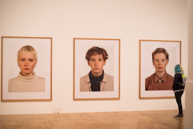
So far I have only been concerned with superficial aesthetics of photography as this is the foremost feature people get to when looking at photographs. Photographs can also be regarded as beautiful beneath their outward appearance and I would assert that this gives such photographs more liability to possess deeper meaning once the message has been uncovered. A photographer I have recently been to an exhibition of: Thomas Ruff springs to mind as an example where the work is not immediately beautiful (at least to my eye) but instead the viewer has to read into the work to find beautiful meanings within the work. One of his most famous projects: Portraits 1986-1991 (see Fig. 2) employs several strategies to enable the viewer to find meaning within the work which I myself found beautiful. Showing Fig. 2 in this size on my blog felt like I was doing a disservice to the impact the enormous print has on the viewer when looking at it in a gallery. On the other hand the superficial aesthetics were not particularly pleasing to the eye; the photographs depicting the blank expressions of people Ruff knew from those years. However, this is part of the ruse where Ruff produces these massive prints of vacant faces, enticing the viewer to wonder why they are printed so monumentally big when they are just like passport pictures. Unearthing the message beneath – for me it was that the passport style pictures allow the viewer their own interpretation of the sitter which is ultimately a contrived one – was a rewarding experience.


Fig. 2. © Thomas Ruff (1988) Porträt (P. Stadtbäumer)


Although I picked up on this meaning somewhat by myself I still had to back up my assertions from another source – ‘a portrait by Ruff looks like a very large passport photograph. … Any personality a sitter may have is there because you, the viewer, have projected your own feelings and prejudices on to the image.’ – (Dorment, 2003). In my opinion this gaining of understanding, while rewarding, is also less immediate and has less widespread ‘appeal’ than the superficially beautiful work of, for example Salgado. Because the reader has to search for the beauty embedded inside rather than on the surface, more casual readers may not bother gaining understanding from work like Ruff’s, where the aesthetics are imbued within. Looking at this from an aesthetic point of view it would be possible to argue that both draw from the vernacular: Ruff playing upon it intentionally by taking all the ‘accidental’ elements out of the traditional vernacular and using them to his advantage like with his Portraits 1986-1991 project (see Fig. 2). On the other hand, Salgado employs telling juxtapositions (like the children juxtaposed with the bones in Fig. 1) and combines this with selective framing and often dramatic, otherworldly lighting. All of this becomes unified because Salgado continues to utilise the black and white medium. Although this might seem like the opposite of traditional vernacular imagery – where colourful, seemingly accidental snapshots are prevalent, looking closer it seems Salgado has culminated the ingredients of the vernacular into a more sophisticated version.


Fig. 3. Photograph 4 - Assignment 3 - Documentary
Fig. 3. Photograph 4 – Assignment 3 – Documentary


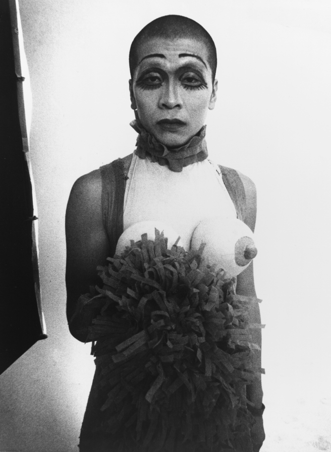
I have until recently always given slight precedence to the superficial aesthetics attribute of my photography and in part it has defined the images I’ve produced for my projects. In hindsight this was perhaps an attempt to move it away from the vernacular type imagery pervading social media. With Assignment 3 – Documentary (see Fig. 3) I turned my attention away from my inward battle between superficial aesthetics and meaning. Instead I put my efforts into telling a convincing story; letting meaning come first and putting aesthetics to the side. Interestingly I found they were still linked as the aesthetics when consistent, combined to tell a more immersive story. However, I noticed certain photographers disregarded superficial aesthetics altogether or even deliberately to make them gritty such as Daido Moriyama. 


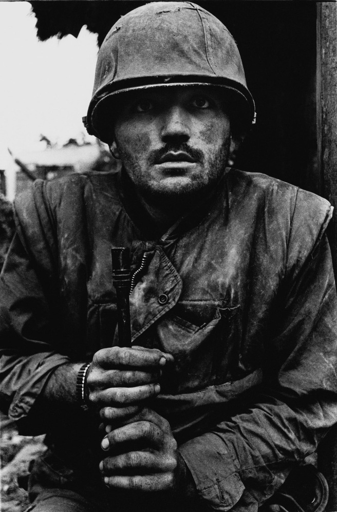
Fig. 4. © Daido Moriyama (1969) Eros


Moriyama at the time he was taking photos on the streets of Tokyo (in the 1960s) prescribed like the group of left-wing photographers he joined to a style developed to break away from aesthetic conventions of a ‘good’ photograph found in European and American photography. They instead employed an aesthetic that ‘was identified with the expression ‘are, bure, boke’ – grainy, blurry and out of focus, in reference to the three main characteristics that distinguished the group’s images’ – (Scaldaferri , 2017). Moriyama’s reasoning for using such gritty aesthetics (see Fig. 4) was that he was ‘Refusing the idea that the photographic medium could only be used to produce archival documents,’ instead ‘putting an accent on its image-making capability’ – (Scaldaferri , 2017). He thereby used the aesthetics of as a conduit to express his emotions about the state of Tokyo’s dark streets at that time. Moriyama was and remains very popular, influencing other photographers and young people especially in Japan: ‘The older generation appreciates a lot of Daido’s work, but right now he is very, very popular among young people’ – (Uematsu, 2012). However, the appeal of his work is not as widespread (outside of Japan) as say Salgado and I would argue this is because it does not conform to (a Western at least) standard taste for the beautiful which has been more popular. An important note this brings up is the subjectivity of aesthetics because the emotion Moriyama’s work evokes clearly affects certain viewers more than others. What I could see influencing me from Moriyama’s work would be the understanding that the process of making an image can be far more important in terms of emotion conveyed in this process than the aesthetic. Having said this, Moriyama clearly intends to go consistently for the ‘are, bure, boke’ look. For me this deliberation could be because his work transcends the traditional vernacular with the choice of black and white medium and emotion caught in the frames.


Conclusion:

While it may be true that photographs with gritty superficial aesthetics are not as accessible as work which conforms to our standard taste for the beautiful, often there is a space for deeper meaning to be accessed by the viewer in the work. This could be whether it is intended by the photographer – by playing upon the vernacular – or not. As long as the work is consistent too the viewer may gain more from a set of photographs than a singular, glorified image. Also it may well be important to the photographer to display emotion in their photographs which in itself could be considered beautiful. In a funny kind of way photographic projects with aesthetics that don’t conform to a standard taste for the beautiful have more art value than work which doesn’t play on the vernacular or is less emotional. All of this depends on what kind of impact the photographer wishes to make and to what type of audience.

‘something considered beautiful conforms to a standard taste, whereas something considered as ugly may confront our present sensibility and bring out a new one.’ – (Fontcuberta and Feustel, 2010). While this quote by Joan Fontcuberta when talking about beauty shows that a deeper meaning or even new sensibilities may be brought out when we are faced with work that is not superficially beautiful, I would suggest it tends to lose the widespread appeal that comes from conforming to our (natural) taste for the beautiful. Yet I would also make the point that confronting our current sensibility and potentially bringing out a new sensibility may be more important to many photographers/artists. This would be especially true considering the current climate of image making where social media platforms are over saturated with similar images that conform to our standard taste for the beautiful.

Word count: 1,860

References:

Datta R., Joshi D., Li J., Wang J.Z. (2006). Studying Aesthetics in Photographic Images Using a Computational Approach. In: Leonardis A., Bischof H., Pinz A. (eds) Computer Vision – ECCV 2006. ECCV 2006. Lecture Notes in Computer Science, vol 3953. Springer, Berlin, Heidelberg

Dorment, R. (2003). PHOTOGRAPHY IN FOCUS The deadpan images created by Thomas Ruff – of nameless individuals and equally anonymous places – are masterpieces of austere neutrality. By Richard Dorment Now for something completely indifferent. [online] Telegraph.co.uk. Available at: http://www.telegraph.co.uk/culture/3595514/PHOTOGRAPHY-IN-FOCUS-The-deadpan-images-created-by-Thomas-Ruff-of-nameless-individuals-and-equally-anonymous-places-are-masterpieces-of-austere-neutrality.-By-Richard-Dorment-Now-for-something-completely-indifferent.html [Accessed 27 Nov. 2017].

Fontcuberta, J. and Feustel, M. (2010). Interview: Joan Fontcuberta, Landscapes without memory. [online] Marc Feustel. Available at: http://www.marcfeustel.com/eyecurious/interview-joan-fontcuberta-landscapes-without-memory [Accessed 27 Nov. 2017].

Moriyama, D. (1969). Eros. [Photograph] Retrieved from: https://theculturetrip.com/asia/japan/articles/daido-moriyama-the-father-of-street-photography-in-japan/ [Accessed 3 Jan. 2018].

Ruff, T. (1988). Porträt (P. Stadtbäumer). [Photograph] Retrieved from: http://www.americansuburbx.com/2010/12/theory-gil-blank-with-thomas-ruff-2004.html [Accessed 12 Dec. 2017].

Salgado, S. (1983). Children playing with animals bones, Brazil. [Photograph] Retrieved from: https://i.pinimg.com/736x/1f/db/12/1fdb126466ae7252c7345014cc4e0438–brazil-children-games.jpg [Accessed 12 Dec. 2017].

Scaldaferri, G. (2017). Discover The Captivating Work Of Acclaimed Japanese Photographer, Daido Moriyama. [online] Culture Trip. Available at: https://theculturetrip.com/asia/japan/articles/daido-moriyama-the-father-of-street-photography-in-japan/ [Accessed 3 Jan. 2018].

Sischy, I. (1991). ‘Good Intentions’. In The New Yorker (9th Sep. 1991) [Online] Available at: https://paulturounetblog.files.wordpress.com/2008/03/good-intentions-by-ingrid-sischy.pdf [Accessed on 23 Nov. 2017].

Sontag, S. (1977). On Photography, 1st ed. [ebook], Penguin Books Ltd, 80 Strand, London, WC2R ORL, England, Chapter 4, pp. 62.

Stallabrass, J. (1997). ‘Sebastião Salgado and Fine Art Journalism’. In Mraz, J. (2002). Sebastião Salgado: Ways of Seeing Latin America [Online] Available at: https://www.oca-student.com/sites/default/files/oca-content/key-resources/res-files/mraz_salgado.pdf [Accessed 12 Dec. 2017].

Uematsu, E. (n.d.). In. Birmingham, L. (2012). “Labyrinth” by Daido Moriyama: Contacting the Urban Jungle. [online] Lucybirmingham.com. Available at: http://lucybirmingham.com/?p=1502 [Accessed 7 Jan. 2018].

Study Hangout 19/11/2017

Today I attended a study hangout with Anne, Bryn and Michael. We talked about very in depth subjects surrounding the ethics of photography including authentication of photographs as documents, subjectivity in photography related to the myth of objectivity, the death of the author and manipulation of the message. We related these in depth subjects with photography artists; the most prominent of these artists being Sebastião Salgado, closely followed by Don McCullin and then Martin Parr. Michael introduced us to the work of Simon Norfolk briefly who I aim to look at more closely as his work at first glance looked very interesting. I was not sure why our conversation was so theoretical but it may have been something to do with 75% of us having commenced work on the critical review or having just submitted it!

Balloon Vendor in Kabul - 2001 - From the Series: "Forensic Traces of War" © Simon Norfolk
Balloon Vendor in Kabul – 2001 – From the Series: “Forensic Traces of War” © Simon Norfolk

My opinions on the listed subjects were that it is very difficult to authenticate documents like photographs 100% as the viewer can usually interpret the evidence of photography being an indexical medium differently. This is even if supporting documents like text or (to a lesser degree) geotagging are included. I felt objectivity is a myth yet it is still possible to shoot in an objective style. Ultimately all photography is subjective (as even objective photography has its own aesthetic) but I would suggest some photography is more subjective than others. Relating to the death of the author, my stance was that this is true nowadays much more with the proliferation of images and ways of sharing them. Now it is not about who took the photograph but what the photograph depicts. The message of any photograph can be manipulated by means of supporting documents and other context like the photographer’s oeuvre.

We talked about the contrast in transparency of message between Salgado and McCullin where McCullin was very decisive in why he took photographs of war while Salgado’s reasoning seems more layered and less clear. We touched upon how my own critical review was going and I divulged that maybe the topic I’d chosen was proving to be too broad and therefore lacking direction. Finding relevant quotes and supporting work or photographs to back up my particular argument seemed like a way of tackling this.

The Gaze and How It is Implemented in My Work

A large part of The Photograph as an Intersection of Gazes: The Example of National Geographic (1991) talked about frontal portraits where the subject’s eyes make contact with the camera and therefore to a certain degree with the reader of the photograph. This was not relevant to much of my photography work including the documentary course as I tended to veer away from portraits – especially frontal ones. However, in Assignment 1 – Documentary I included a few frontal portraits and my tutor had highlighted the need for consistency where there were other people shots in the set where the person did not make eye contact. I now see why my tutor made this point because The Photograph as an Intersection of Gazes: The Example of National Geographic (1991) made me realise just how different these two types of gazes by the subjects of the photograph can be for reader interpretation.

Later on in the essay it interested me where it mentioned if the readers gaze is interrupted (by disjointed composition or bad processing) then it is ‘more likely that the photographic gaze will be resisted by the reader.’ – (Collins and Lutz, 1991). This seemed to be related, like my tutor’s comments, to photographic consistency which was so important in ‘pulling the viewer (or ‘reader’) in to the photograph or set of photographs. Therefore I would endeavour to amend the series of photos for Assignment 1 where sometimes the subject made eye contact to instead either always having eye contact or none at all for the sakes of consistency. Also I would try to make sure the processing wasn’t over done which might also detract from the reader’s gaze into the image.

An aspect of the essay which was not particularly relevant for me was the comparisons and observations made about the non-Westerner’s and Westerner’s gazes. My work so far has been exclusively local-based and where I have lived is Western, therefore I could not associate with these gaze differences. However, I could see how this could be relevant to my practice: if I was photographing poorer or richer communities than myself then the subject’s gaze, the photographer’s (my own) gaze and the viewer’s gaze would be affected.

I have so far always edited and shot my own photographs; choosing the cropping, processing as well as where and how it appears in a sequence and with what, if any captions. Therefore I have had the luxury of being able to directly affect the reader’s gaze from the perspective of a magazine editor’s gaze and a photographer’s gaze. However, I learnt that despite affecting the reader’s gaze from both these perspectives, a lot of the photograph’s meaning was still down to the reader’s gaze. The reader’s gaze is about ‘what they imagine the world is about before the magazine arrives, what imagining the picture provokes, and what they remember afterwards of the story they make the picture tell’ – (Collins and Lutz, 1991). I imagined these points as the reader superimposing their own meaning over the intended meaning created by the photographer/editor. I myself have done this plenty of times when looking at artists’ photographs in exhibitions without looking at any captions or linking text first. This made me wonder whether I should look at embracing photography’s often inherent ambiguity rather than striving to make the meaning as legible as possible?

References:

Collins, J. and Lutz, C. (1991). The Photograph as an Intersection of Gazes: The Example of National Geographic. In. Wells, L. (2003). The Photography Reader. 1st ed. Oxon: Routledge, pp. 354-374.

Thomas Ruff at the Whitechapel Gallery (Photographs 1979-2017)

The main impression I came away with from visiting the Whitechapel Gallery on the 2nd November 2017 to see the Thomas Ruff exhibition was that Ruff took a very playful approach to his exploration of the processes, genres and aesthetics of photography. This playful approach was tinged with a more serious undertone as he addressed issues like photographic technique and how this changes with technological advances.

Thomas Ruff's 'Portraits' - 1986-1991 'Dwarfing' an Exhibition Goer at the Whitechapel Gallery
Thomas Ruff’s ‘Portraits’ – 1986-1991 ‘Dwarfing’ an Exhibition Goer at the Whitechapel Gallery

There were many aspects I didn’t ‘get’ regarding Ruff’s photographs but some things I had an inkling about and I have written down some of these observations here. I would start with the size of the prints: lots were enormous in scale; dwarfing people and his other, smaller prints in the exhibition. However, I didn’t feel these prints were gigantic only for effect in making the viewer say wow (although this may have been part of the reason!) The other reason (at least with Portraits 1986-1991) was to displace presumptions that a passport photo should appear small and make the viewer contemplate why this might be. For me it was because although the appearance was the same (in terms of lighting and composition) to a passport photo, the scale was the opposite of what we might expect from a passport picture. This brought up implications of seeing these people depicted as unique – because they are printed so large the viewer tries to find expression from an expressionless face.

Thomas Ruff's 'jpeg' - 2004-2008 Works When Viewed From a Large Distance Appear of 'Good' Quality
Thomas Ruff’s ‘jpeg’ – 2004-2008 Works When Viewed From a Large Distance Appear of ‘Good’ Quality
'jpeg' - 2004-2008 © Thomas Ruff When Viewed From Up Close Reveals Itself as Very Pixellated
‘jpeg’ – 2004-2008 © Thomas Ruff When Viewed From Up Close Reveals Itself as Very Pixellated

A similar study of scale could be seen with his series jpeg 2004-2008. Here from afar the enormous prints appear sound to the eye, showing the destruction of New York’s twin towers. However, as you get closer the image begins to break up and become pixellated as it becomes clear they are of very low quality, taken on mobile phones using jpeg. I inferred meaning from this in that although the event is of such high importance the quality used to record it can often be of low integrity and yet it is usable; the images are still circulated and viewed on such large scale.

A Selection of Thomas Ruff's 'Nights' - 1992 - 1996
A Selection of Thomas Ruff’s ‘Nights’ – 1992 – 1996

Another, constant theme throughout Ruff’s work is experimentation; constantly pushing the boundaries by exploring the limits of photography. From documentary style night shots using a special surveillance camera making the ordinary seem otherworldly, to the digital photogram, Ruff changes his approach and techniques according to technology, often with hauntingly beautiful results in my opinion. His experimentation did inspire me to try out different techniques myself and his postmodern appropriation of existing imagery was intriguing.

An Example of Thomas Ruff's 'photograms' - 2012 - 2015
An Example of Thomas Ruff’s ‘photograms’ – 2012 – 2015

One such series of works in particular really caught my eye. press++ 2016- were (again) giant prints, appropriated from the archives of news agencies. I did wonder how the writing and stamps had appeared on the images themselves as it appeared quite natural. I found out that Ruff ingeniously overlaid the backs of the photographs containing all the context and information about the photograph onto the front of the photograph. This was quite unique because the context appeared in the same place as the content. I discovered the result to be an interesting combination of text and image that worked well.

A Selection of Thomas Ruff's 'press++' - 2016-
A Selection of Thomas Ruff’s ‘press++’ – 2016-

Overall I was glad I went to this exhibition as it made me think a lot about image size when presenting work, experimenting process and techniques with my own work and brought up some novel ideas concerning the photograph as an object.

References:

Thomas Ruff: Photographs 1979-2017 [Exhibition] 27th Sep – 21 Jan 2018. Whitechapel Gallery, London.

How to Photograph an Abstract Concept

As I have been studying documentary I have become increasingly aware of the need for a clear brief. This enables more incisive photography in my experience. The reverse I’ve found can also be true – in my recent Assignment 3 – Gentrification in Deptford I was struggling for a clear brief and started using post-conceptualisation as a strategy so that I could just start taking pictures and see what developed from there. However, for my upcoming Assignment 5 – A Personal Project, one of the requirements for the assignment is ‘a methodical approach’. Therefore I could either use post-conceptualisation as a method or do the opposite and produce a clear brief but not somewhere in between.

One area I’ve realised could be improved in my work would be the inclusion of an abstract concept rather than literal concepts in producing a clear brief. With the exception of Assignment 2 – Ephemerality of the Image where I developed the idea of an abstract concept, I have not explored abstract concepts. One essay that really inspired me with regards to abstract concepts particularly for Assignment 2 was Maartje van den Heuvel’s Mirror of Visual Culture. Here I eventually discovered a way of photographing an abstract concept – ephemerality of the image but the process of developing the ideas was quite drawn out.

I decided on a whim to make a search on the internet: “How to photograph an abstract concept” without much hope for inspiring results but was pleasantly surprised a few search results down to find something other than a list of ’20 ways to instantly improve my abstract photography’, which was what the rest of the results seemed to consist of! The search result in question linked to an essay by John Suler called Photographic Psychology: Image and Psyche relating to conceptual photography. I found Suler’s essay to be accessible and practical and here were some of the observations I came away with after reading the essay:

I had been thinking about photography in the ‘wrong’ order in my mind at least; writing loose briefs and hoping for something creative to come out of my observations on research conducted. Instead I learned it was preferable to think of a concept in conceptual photography first and think about how this might best be represented as a photograph or set of photographs afterwards. In particular, ‘Photographs also offer a seemingly more real, tangible depiction of concepts that otherwise seem abstract or elusive.’ – (Suler, 2013). Many of my previous projects had been literal concepts so learning that one of photography’s strengths lay in depicting abstract concepts was interesting for me.

One part of Suler’s essay that I had an opinion on was: ‘[conceptual artists] are free to use an idea as the guide in creating a work, rather than being restrained by aesthetic standards about how things are supposed to done. – (Suler, 2013). Although I agreed with this statement on the most part (as opposed to creating just aesthetically-pleasing photographs like in non-conceptual photography), I felt there was an additional side to conceptual photography often being minimalistic and perfunctory in style. As the idea behind the photograph or set of photographs becomes more complex (the conceptual art I’ve come across often is quite complicated in concept), the execution of the photograph almost needs to be simple. This is in order to get across the message as lucidly as possible for a complicated idea. Suler (2013) touches upon this when he remarks ‘The process might be very challenging and creative, especially when dealing with complex or elusive concepts.’ when talking about creating artistic photographs for conceptual art. My response would be the perfunctory approach for the resultant photographs is kind of like a style for complicated concepts, not only to get across the message of the art but also also a deliberate attempt by the artist to signify the art is more important than the photograph.

A photograph’s concept can be translated into an image either specifically or ambiguously. When it is translated ambiguously, viewers tend to project their own meaning or understanding of the concept onto the photo which is what some photographers want according to Suler (2013): ‘The photo presents the container of a general concept or idea, but then people fill that container with their own personal meanings.’ When creating abstract concepts in photographs I would prefer for the viewer to infer meaning but for it to be not too ambiguous so somewhere in the middle. Suler (2013) is of the opinion that for the more specific of these approaches a clear understanding of the concept is desirable before visual communication commences.

As I was more interested in creating images for abstract concepts, it was useful to note from Suler’s essay that he recommended the use of a dictionary, thesaurus and online image search engine to aid the sender of the concept (the photographer) in acquiring a better understanding of the ins and outs of their abstract concept. He also states that ‘Symbols, metaphors, and similes are very useful when designing conceptual photographs.’ – (Suler, 2013) whereby the receiver of the concept (the viewer) could associate signs a photograph may possess in order to gain the sender’s meaning. Therefore if I wanted to create a photograph symbolising entropy of meaning in social media imagery, I could look up the definitions and synonyms for entropy and social media. Then I could see how other people represent entropy or social media in their photographs/images and also think about symbols, metaphors and similes that would be appropriate once I had a more lucid idea of what the concepts entailed.

Lastly, Suler touched upon post-conceptualisation (which I used for Assignment 3 – Gentrification in Deptford) although he used the term ‘reverse engineering’ of the conceptual photograph. Here he basically describes the process I went through with Assignment 3 where I took photographs first and then ‘apply an idea to it’ – (Suler, 2013). While both approaches can be effective I felt the more appropriate strategy of conceptualisation of an idea beforehand would perhaps be better for Assignment 5 where ‘a methodical approach’ was desirable.

References:

Suler, J. (2013). Photographic Psychology: Image and Psyche. [online] Truecenterpublishing.com. Available at: http://truecenterpublishing.com/photopsy/conceptual.htm [Accessed 23 Oct. 2017].

Van Den Heuvel (2005). Mirror of Visual Culture. Documentary Now! [online] Available at: https://www.oca-student.com/sites/default/files/oca-content/key-resources/res-files/heuvel_discussingdocumentary.pdf [Accessed 23 Oct. 2017].

Study Hangout 22/10/2017

Today I attended a study hangout with Miriam and Leonie.

The Hell of Sierra Pelada mines, 1980s - © Sebastiaou Salgado
The Hell of Sierra Pelada mines, 1980s – © Sebastiaou Salgado

It was good to hear their progress and we were at similar stages in the course although Leonie had almost finished Assignment 5. Miriam and I were starting the critical review for Assignment 4. I discussed my ideas for Assignment 4 with the group – the idea of beauty in documentary and whether a really aesthetically-pleasing photograph takes away from the meaning a photograph may be trying to convey. The responses from Leonie and Miriam were very interesting for me, with Leonie comparing the work of Tim Hetherington and Don McCullin’s American soldiers photographs saying that one was rendered completely differently from the other in regards to beauty. Looking at the two photographs side by side I could definitely relate to this observation.

Korengal Valley, Afghanistan - © Tim Hetherington - 2007
Korengal Valley, Afghanistan – © Tim Hetherington – 2007
'The Thousand Yard Stare' - © Don McCullin - 1968
‘The Thousand Yard Stare’ – © Don McCullin – 1968

I used the work of Sebastiaou Salgado as an example of aesthetic beauty with the potential for displacing meaning because his photographs have been typically so beautiful. Miriam countered this point by saying one of Sebastiaou Salgado’s photographs – that of a gold mine (The hell of Serra Pelada mines, 1980s, was the photograph I think she was referring to) means she no longer buys gold but only fair-trade; the photo by Sebastiaou Salgado had made such an impression on her. This could make the case that beauty captures the viewer’s attention with the possibility for meaning to be discovered afterwards in the same image, which should be something to consider when writing my critical review.

Lastly we discussed juggling things like work with the course and how it affects the flow of our studying. Also what our plans were after competing the documentary module and how often it would be helpful to liaise with our tutors in order to improve assignments.

Overall I found the study hangout to be very helpful as always but in particular it did give me some more points of consideration for my critical review.